
Colours: CMYK vs. RGB vs. Pantone
In an ideal world, red would be red, blue would be blue and green would be green. Often, when we’re designing, the ask is “make it blue and yellow”; which seems simple enough, but the truth is there’s thousands of options of blue or yellow. I’m not just talking light blue vs. dark blue, I’m talking CMYK, RGB and Pantone values and the seemingly unending options they each hold.
It’s important to understand the difference between these colour modes and when to use each.

CMYK
CMYK stands for Cyan, Magenta, Yellow and Key. In laymen terms, you can think of this as blue, red, yellow and black. The CMYK color model is also called “process color” or “four color”, and it is a subtractive color model, which means as the colors overlap, the light wavelengths are absorbed and what you see is the visible spectrum of wavelengths that weren’t absorbed.
If you don’t care to know the science, just know CMYK uses a mixture Cyan, Magenta and Yellow create the whole range of colors. Within CMYK you can adjust the levels of each color by percentages to produce different colors.
When using CMYK in graphic design, you’re digitally assigning a value for each C, M, Y and K to produce the desired color. The printing process then mixes those exact values to produce the color in print. This is why it’s called four color — the printers literally mix the exact values of C, M, Y and K to print.
An important thing to understand about CMYK is halftoning. The print process actually overlays tiny dots of C, tiny dots of M, Y and K over each other to produce, what seems to the human eye, a solid tone. Though up close you can see it is indeed pixelated. What’s nice about halftone is it is a really cost-effective solution to multiple-colored designs. Rather needing, say 20 inks, you can provide all 20 colors with just the four CMYK values. Whatsmore, halftones allow for nice gradients and transparencies.
A big downfall to CMYK however is color consistency — the CMYK value may look different in production depending on printers.
RGB
Opposite of CMYK is RGB, and this stands for Red, Green Blue. RGB is an additive color model, which means it adds the color’s light wavelengths together to produce new colors.
RGB is use for digital and electronic coloring — so TV, HTML (websites), digital cameras and so forth are best suited for RGB color mode.
RGB is a device-dependent color. This means different devices may display the RGB values differently.
Pantone
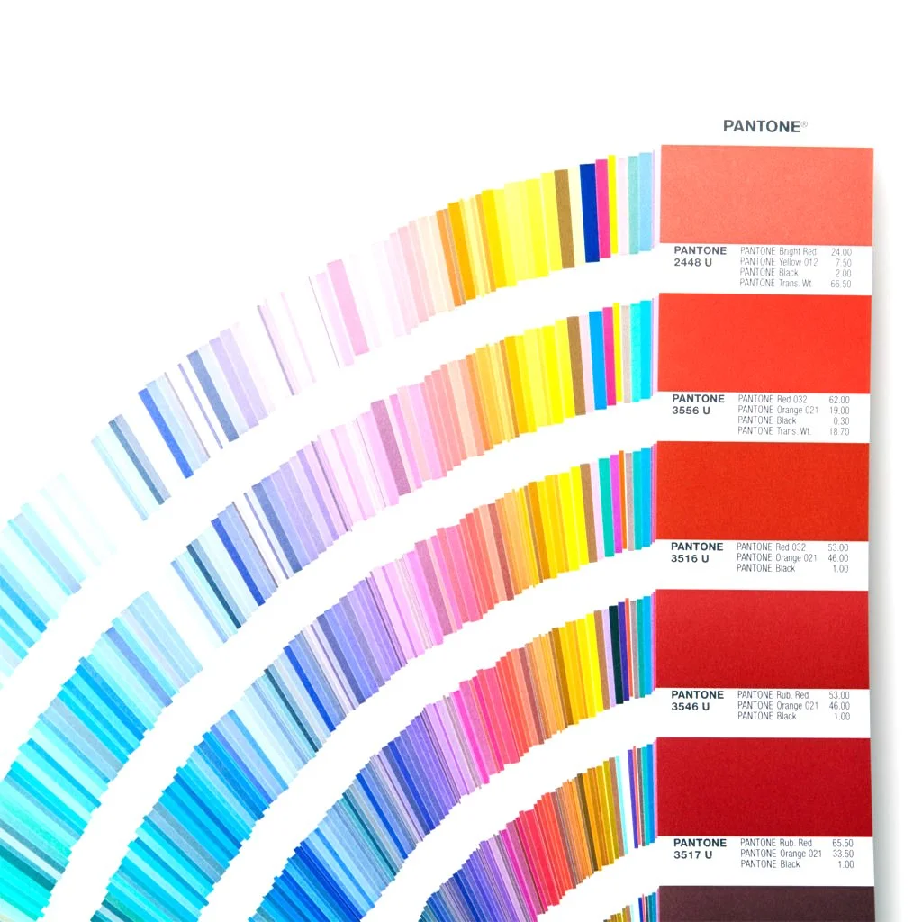
Pantone; also known as, Pantone Matching System or PMS is actually a company that has created a proprietary color space mostly used in printing. Pantone is the standard in color matching and standardization. Pantone uses the CMYK method to produce what’s called a spot color; also known as solid color. Spot color prints a solid color, not CMYK halftone dots to create a color. Though, Pantone can produce colors beyond the CMYK gamut including metallics and florescents.
Here’s the deal, CMYK can look really different from screen to screen, and it can look even more different in real life print. Pantone set out to solve this problem by producing physical swatches of all the colors and assigning a numeric value to them (ie. Pantone 103, or Panton 365C)
Pantone has dozens of physical swatch books and digital books to match so you can use the Pantone colors in your digital artwork. The beauty of Pantone is it will always look the same — no surprises. It is possible to use just the digital books for Pantone, but I highly recommend having the physical books to ensure your screen isn’t misleading your expectations as to what the color will look like.
As well, Pantone comes in coated and uncoated, which literally refers to the paper the ink is printing on. So when you’re designing for print, be sure to take the material into consideration for choosing which PMS book you’ll be needing.
Printing in Pantone will always produce sharp, consistent colours — but do note that when printing in Pantone, each colour requires its own ink and screen — so this can be a very costly print method if not done right.
When to use CMYK vs. RGB vs Pantone
CMYK
Collateral print
Home printing
When budget is concern
RGB
Digital
Pantone
Screen printing
Textile/product manufacturing
When color accuracy is important