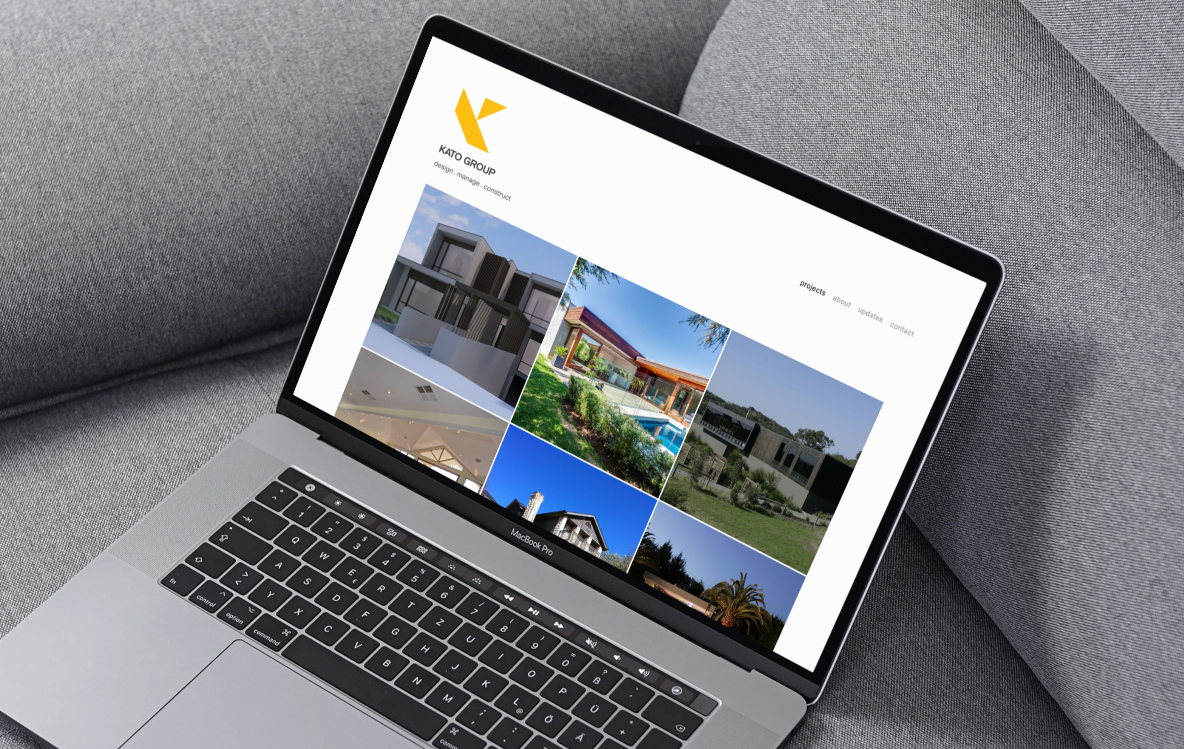
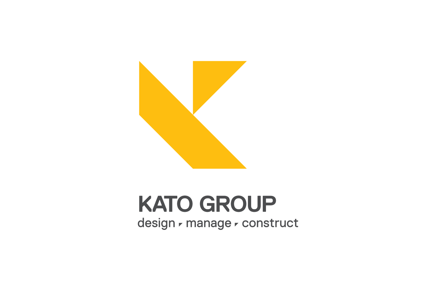
A well established niche architecture and building practice, Kato Group's brand was not inline with their aesthetic and approach. South were engaged to enliven their brand to create a more professional and modern identity.
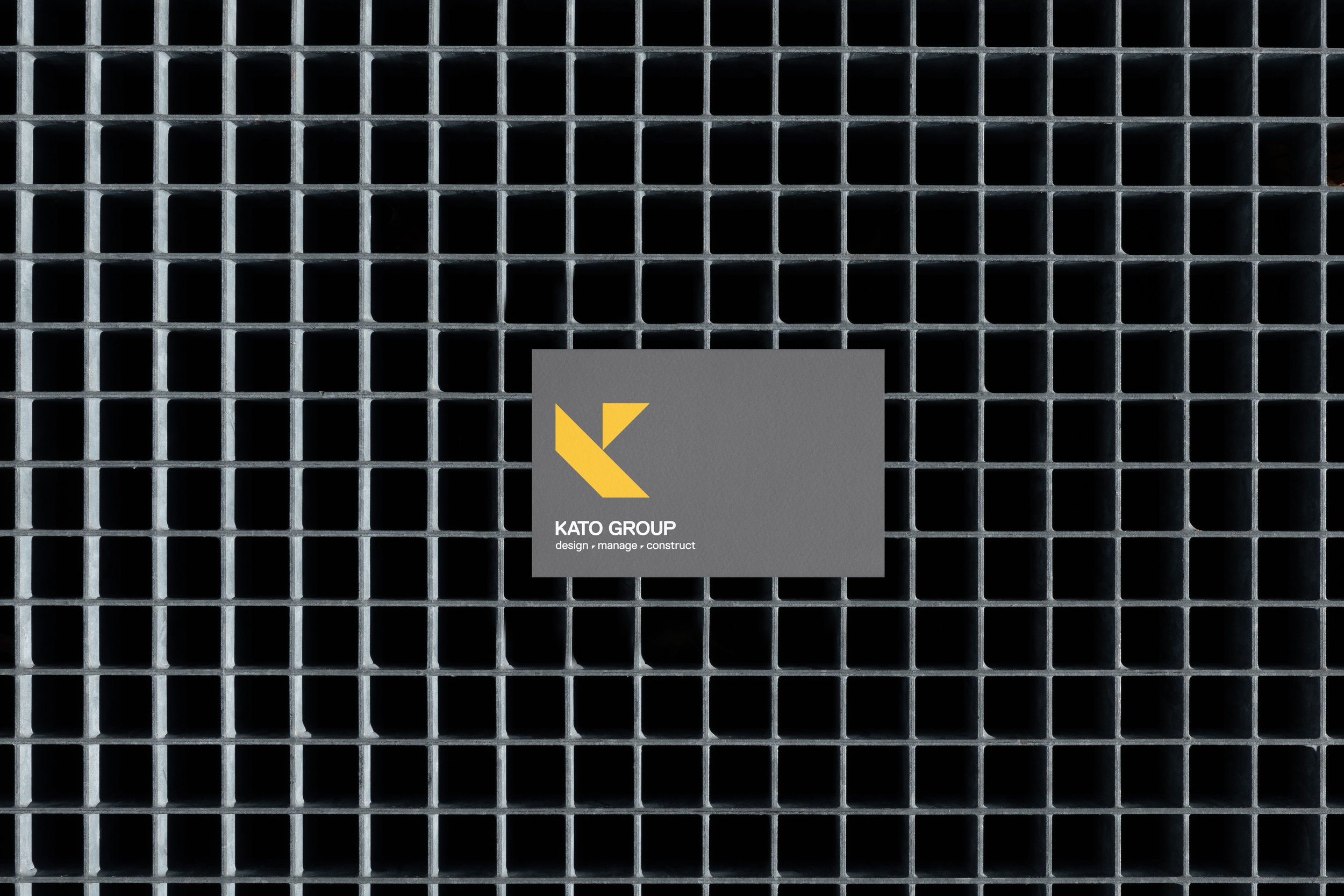
We kept thinks simple utilising an angular K icon depicting the clean lines of construction. Using a strong yellow and a charcoal grey, we gave the brand some pop. A suite of collateral was rolled out along the simplistic lines of the logo.
BRANDING – COLLATERAL – PRINT – DIGITAL
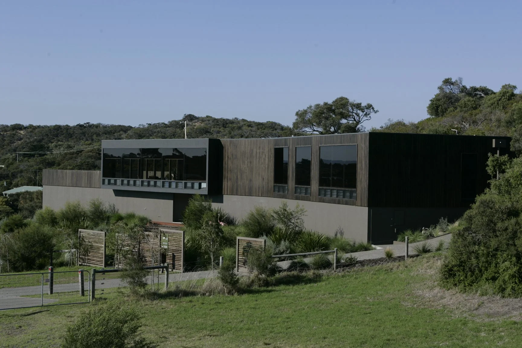
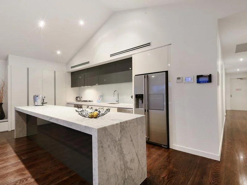
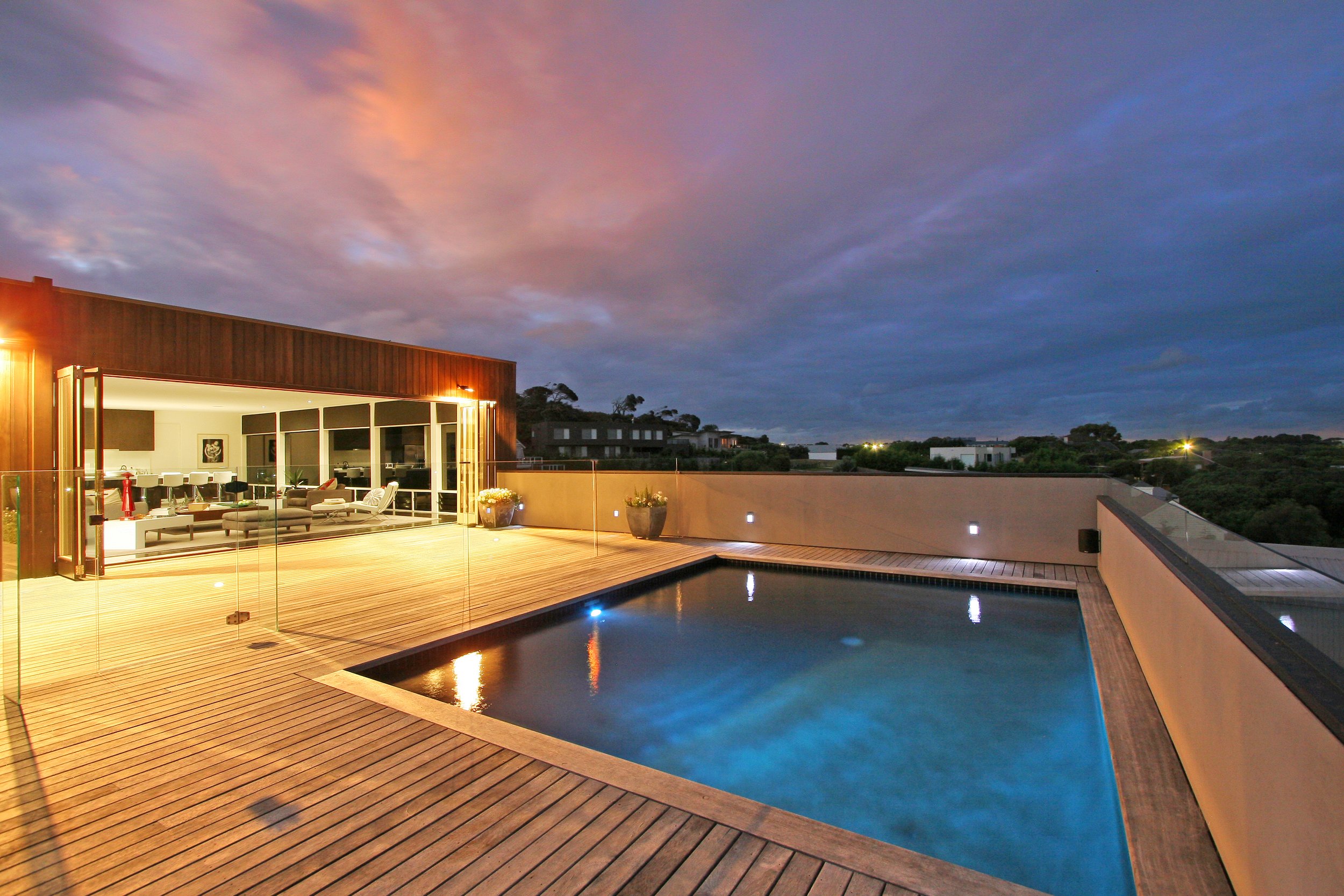
Kato Group tailors their design process to meet clients’ specific requirements which result in memorable spaces that inspire, engage and excite.