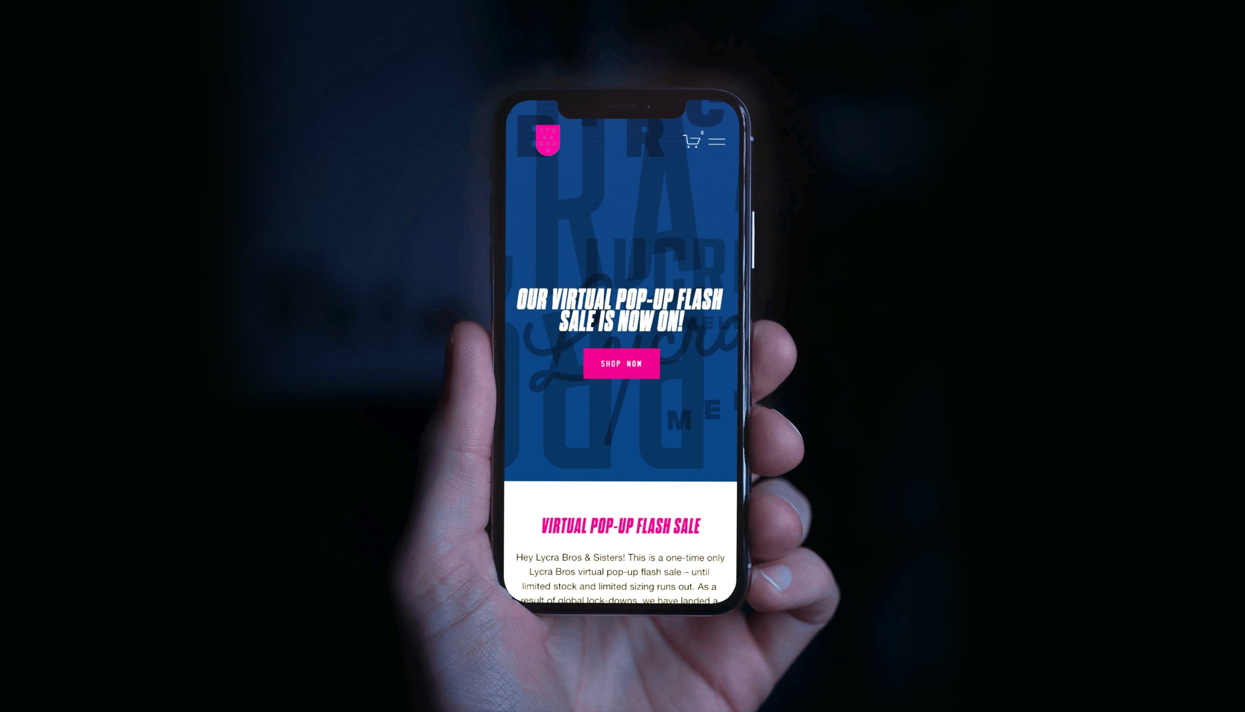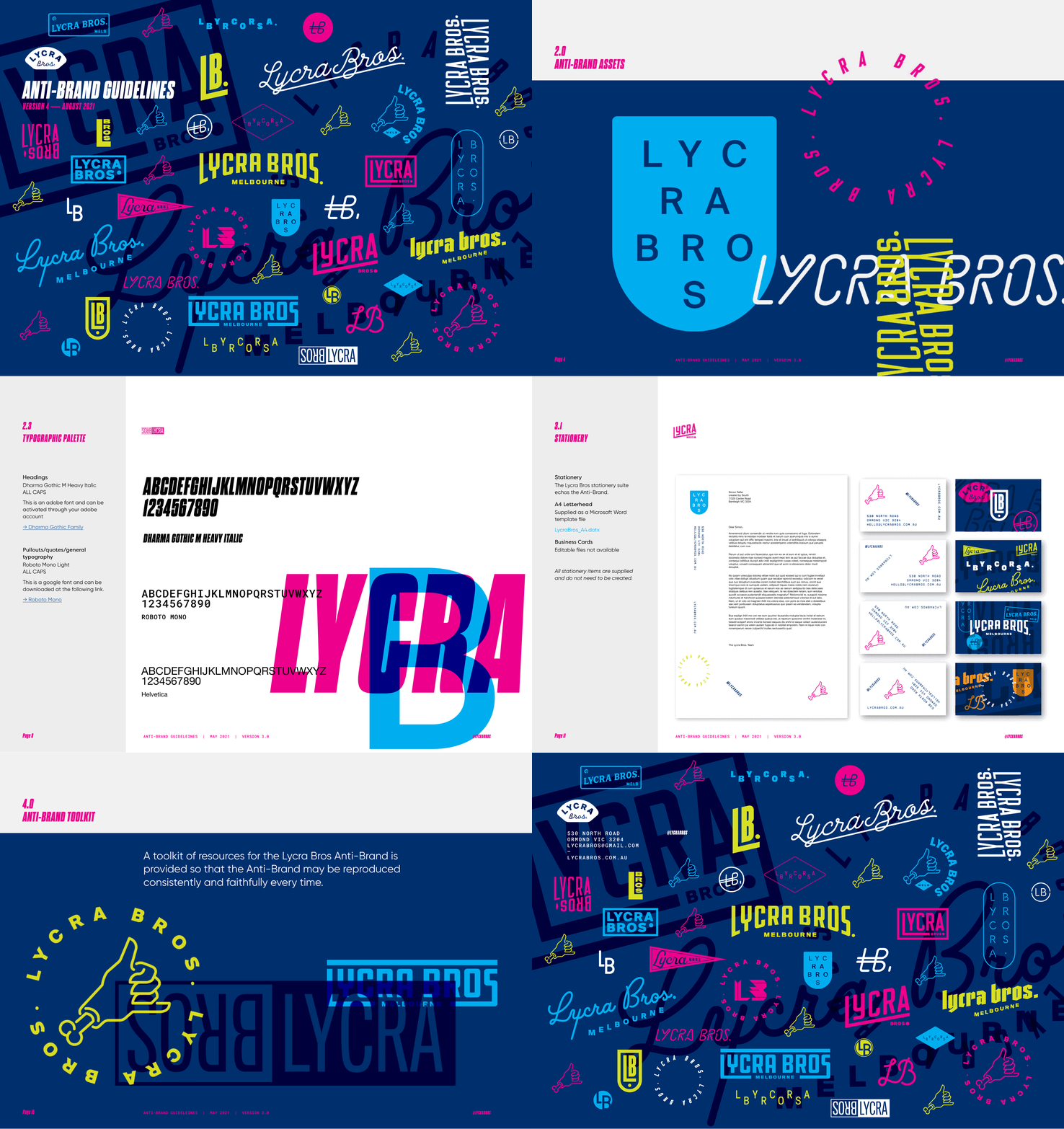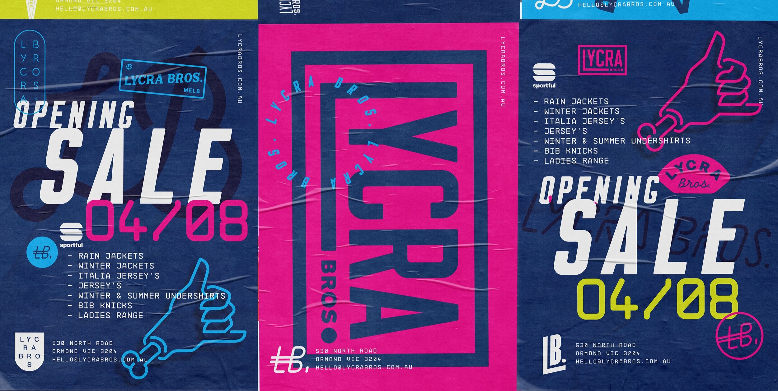
Lycra Bros. let us run wild and as a result an ‘Anti-Brand’ was born. that allows them to utilise a collection of logos and marks to go crazy or reel things in IF subtlety is required. They are a cycling retail store loaded with quality cycling kit at great prices, rather than the minimalist, sparse ‘concept store’ doing the rounds at the moment..
BRANDING – PRINT – DIGITAL - ENVIRONMENT
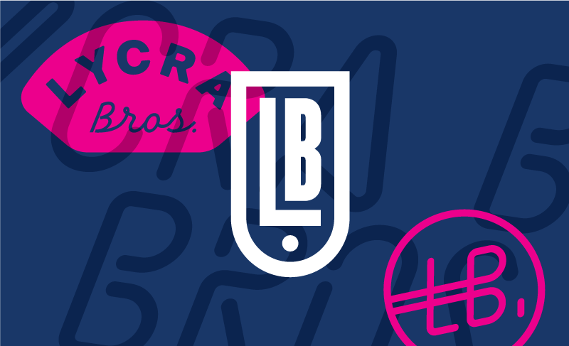
A huge collection of logos was produced to create the anti-brand. These can be used in all sorts of ways and all at once, enabling some chaos and over the top, memorable applications.
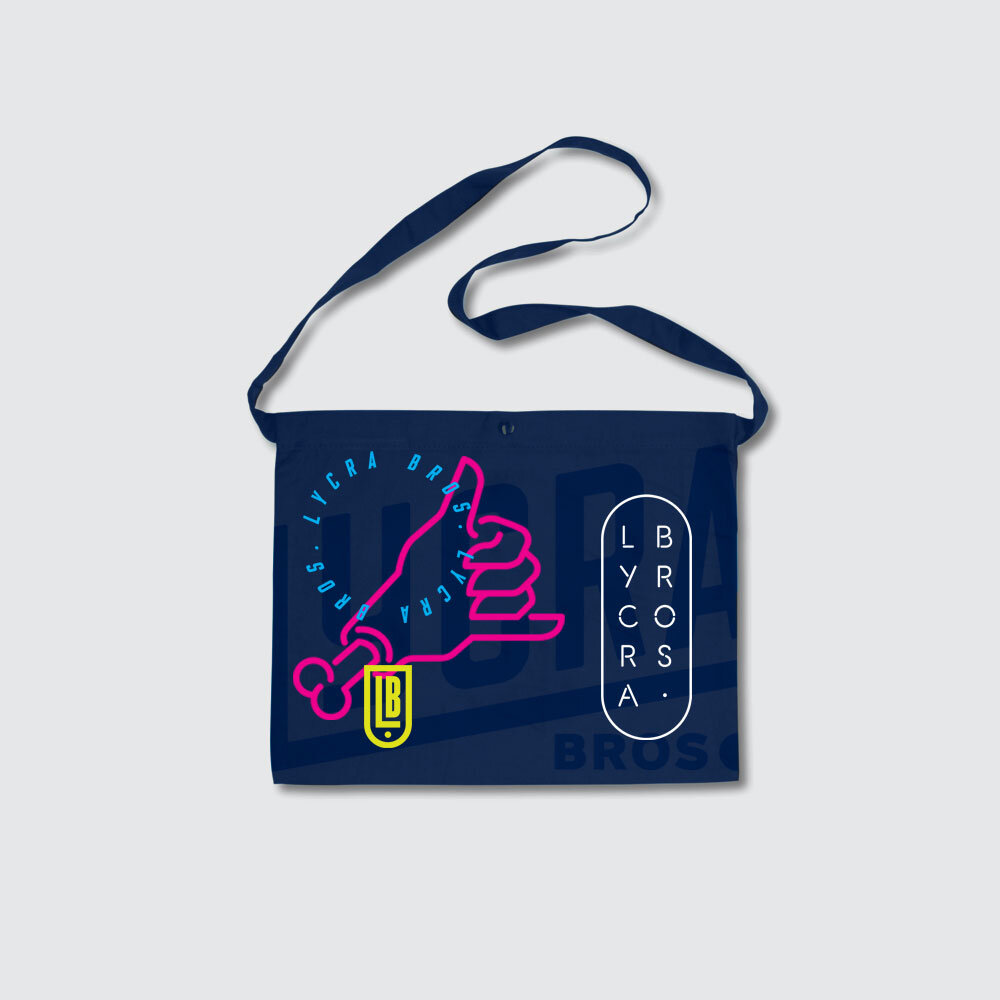
The Lycra Bros shaka is a key device used through all communication. It ties into the essence of Lycra Bros - friendly, inclusive and no bullshit.
Collateral was big bold and bright, utilising the distinctive typography, colours and anti-brand.
A plethora of cycling related stuff was developed and is being rolled out to Brand, promote and aid in Lycra Bros growth.

