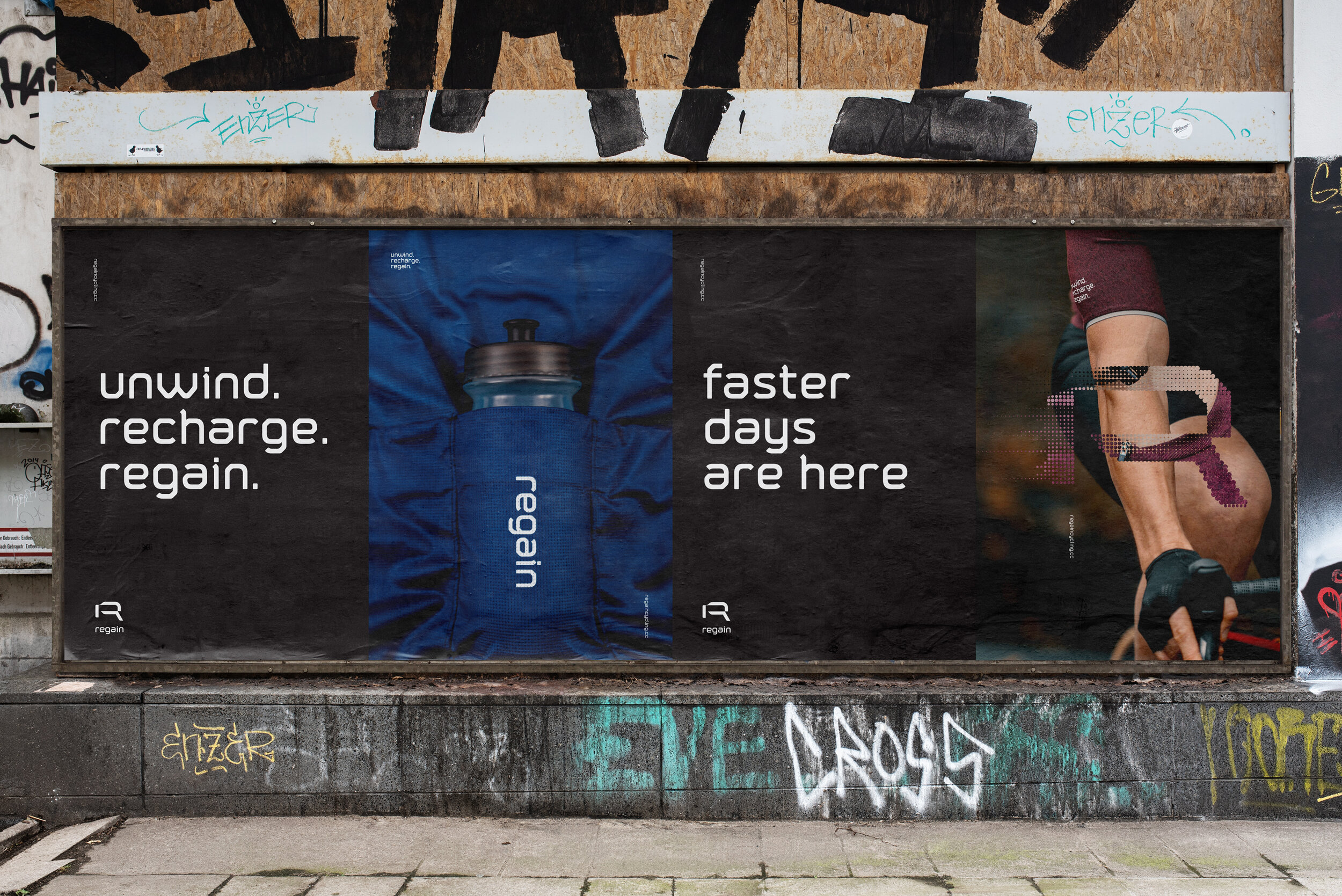
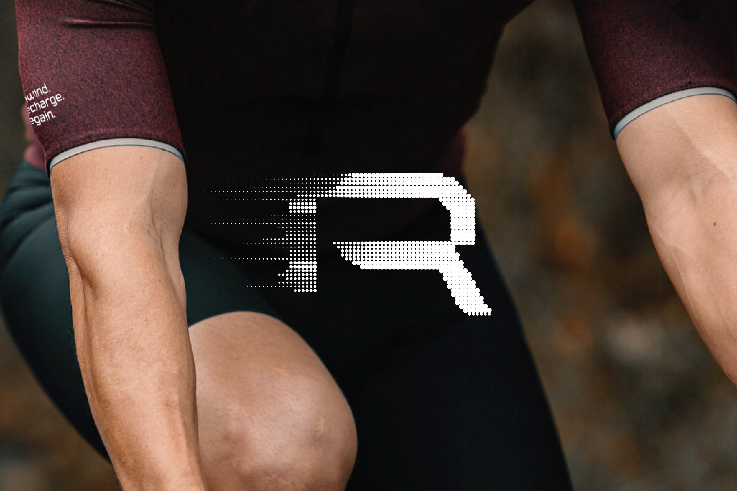

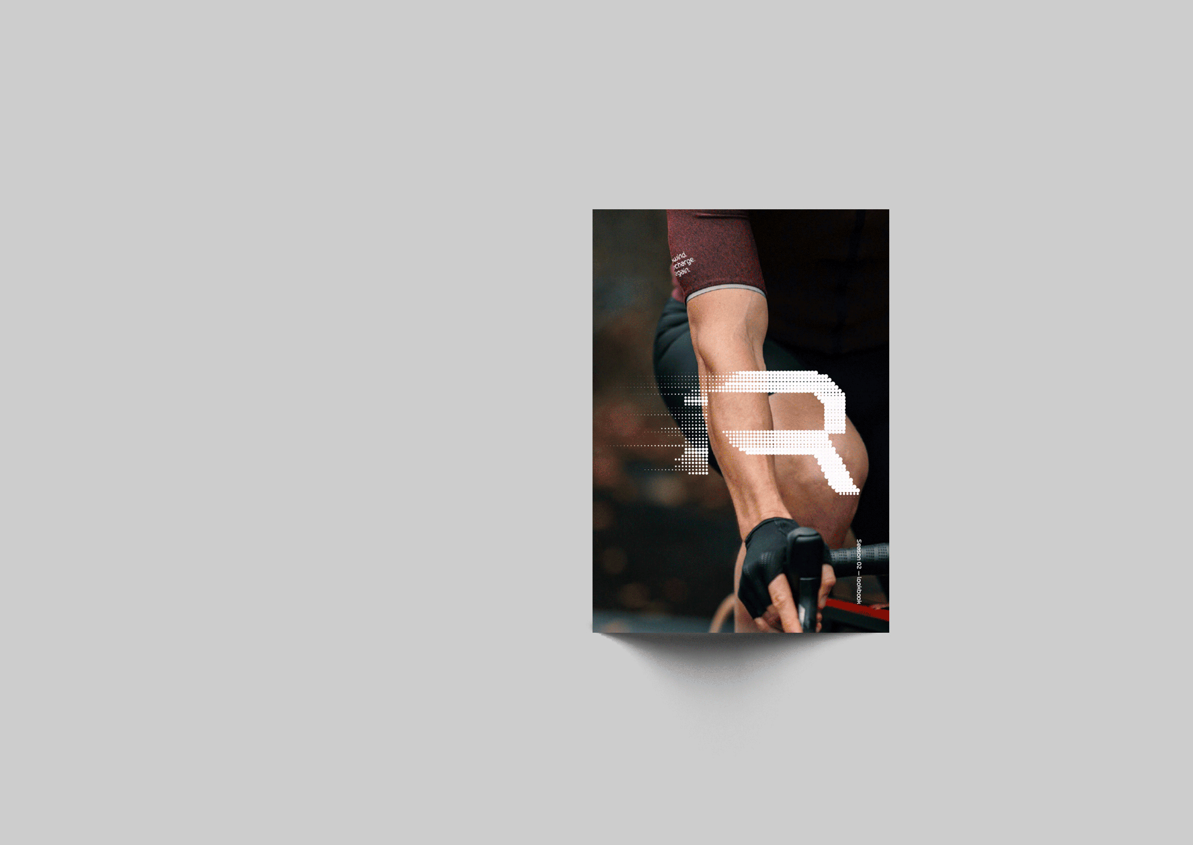
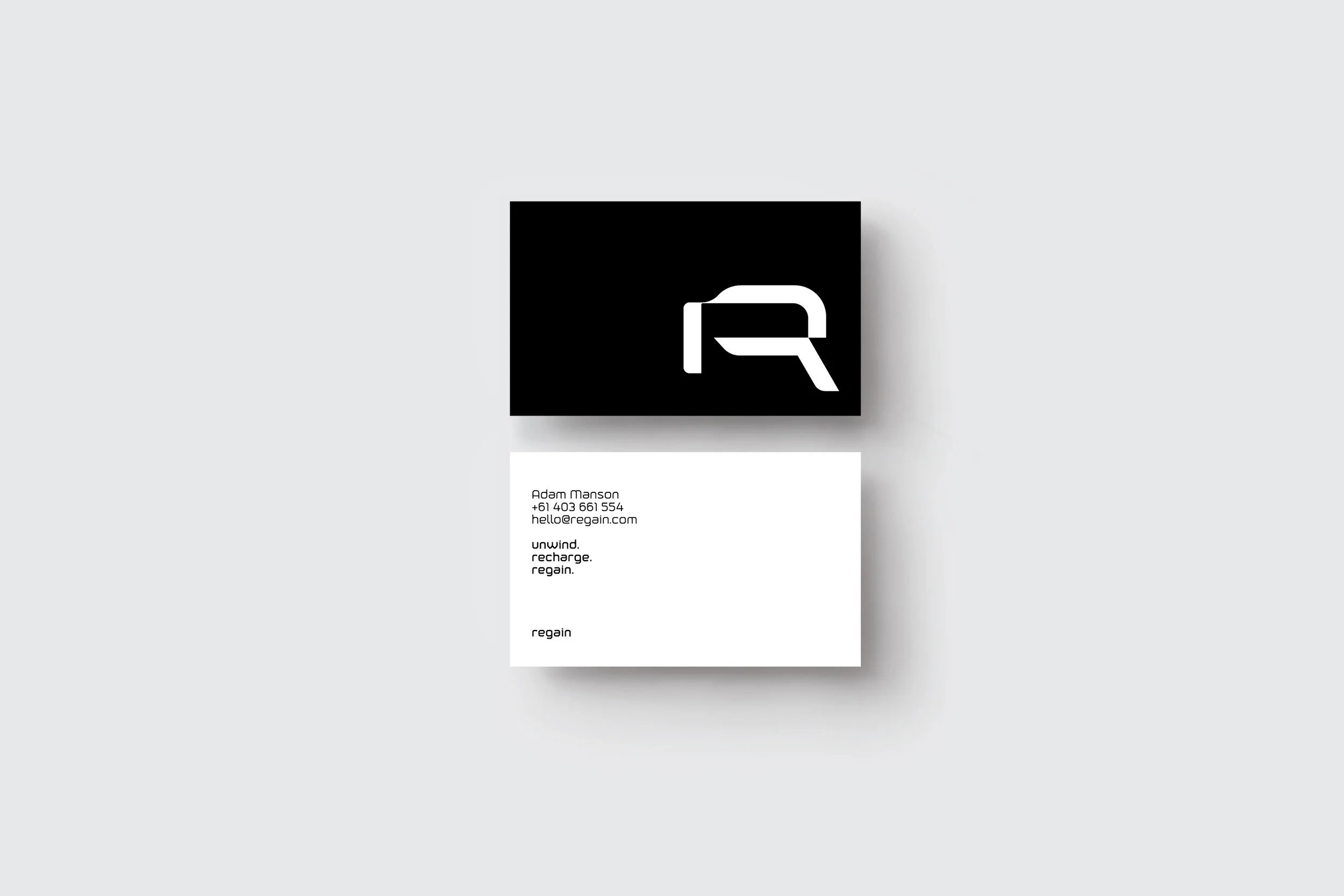
We worked with Regain to develop their brand and strategy to align with the company beliefs. A simple adaptable set of elements were developed to aid in building brand awareness, without being repetitious and clinical.
BRANDING – PRINT – DIGITAL – APPAREL

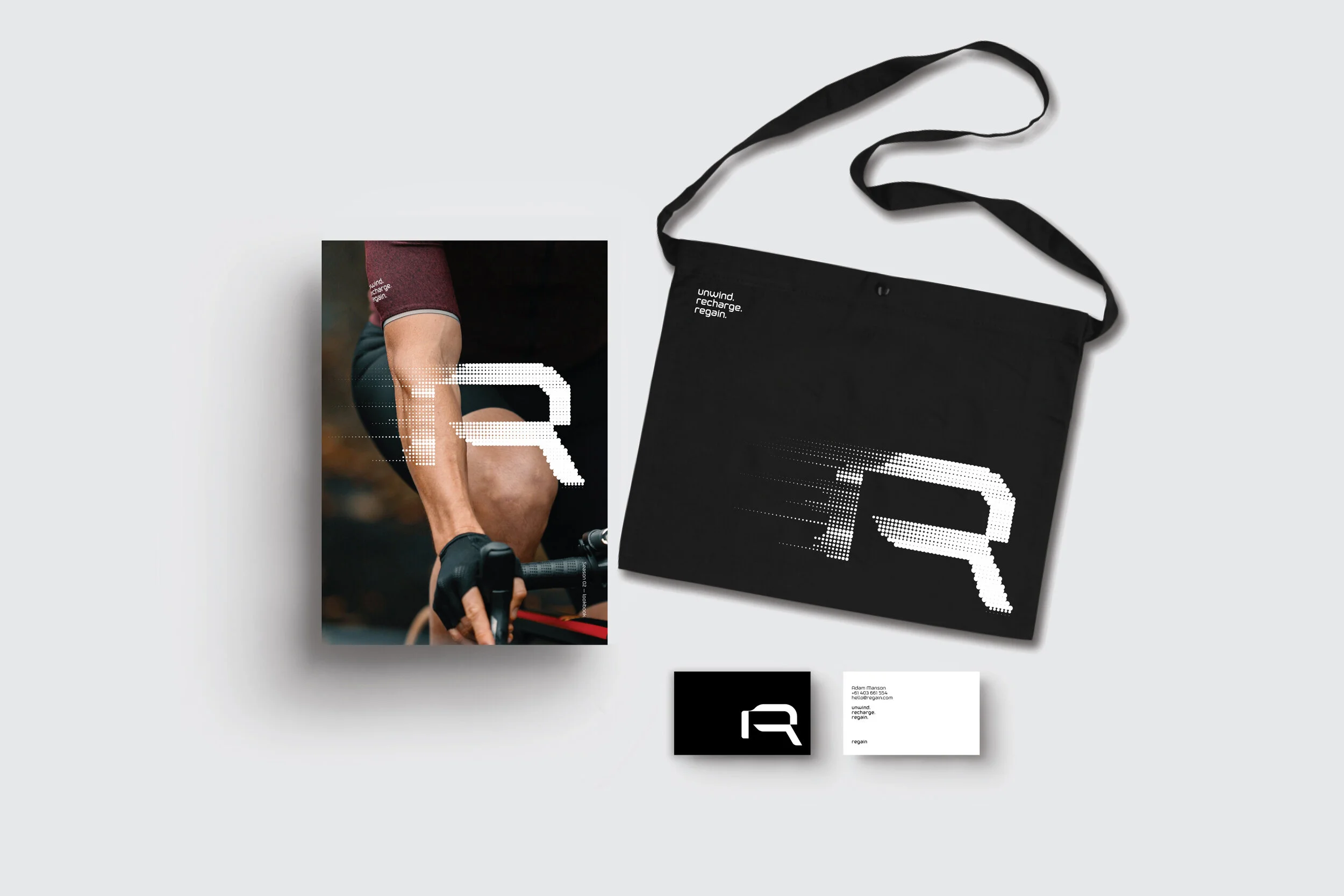


TYPOGRAPHIC EXPRESSIONOur approach to the typographic style was to juxtapose a couple of typefaces that might not ordinarily work together. High contrast weight and width allows for adaptability throughout the identity and a distinct personality that is very ownable