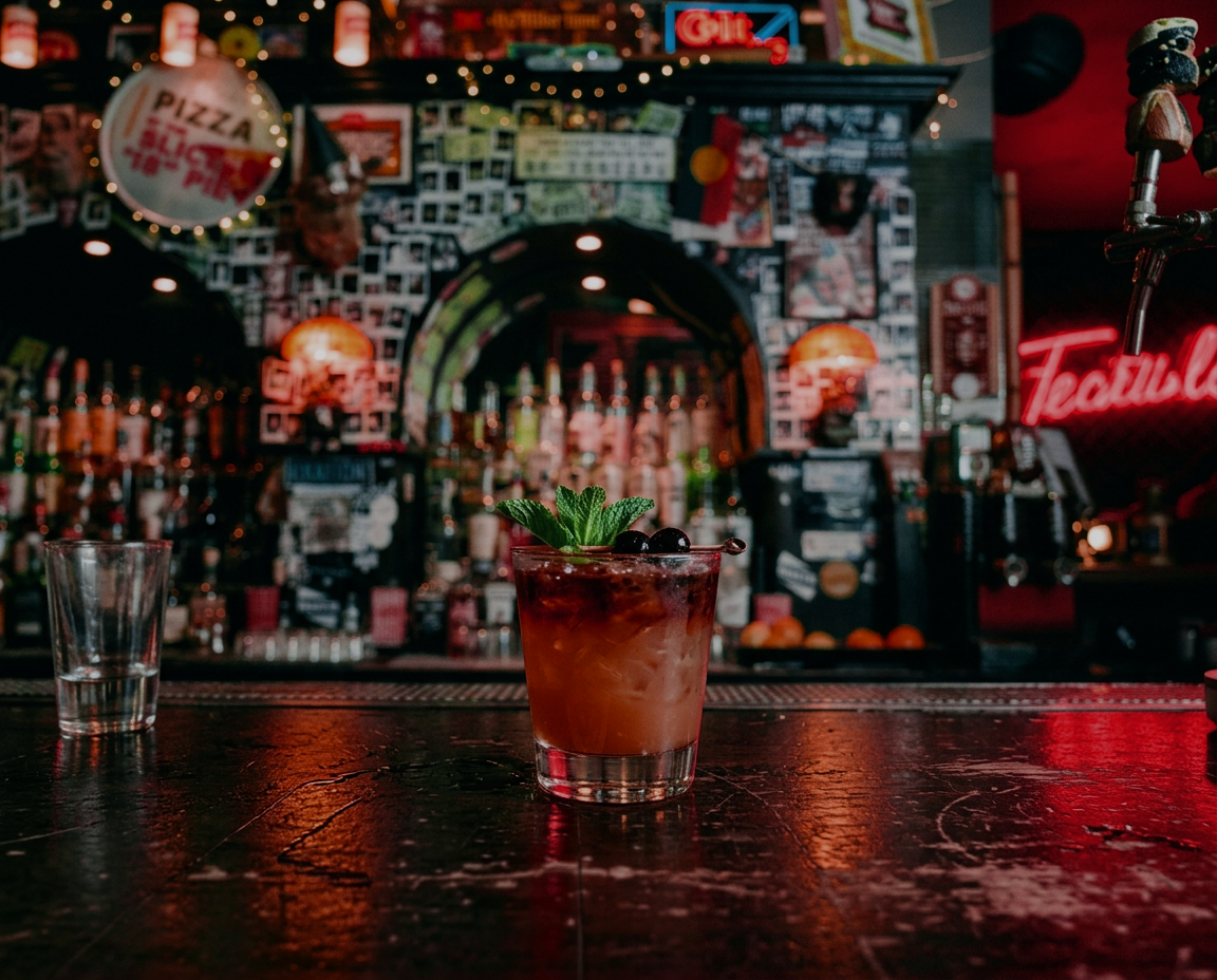
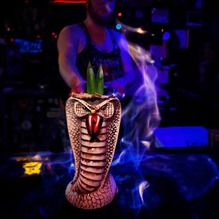
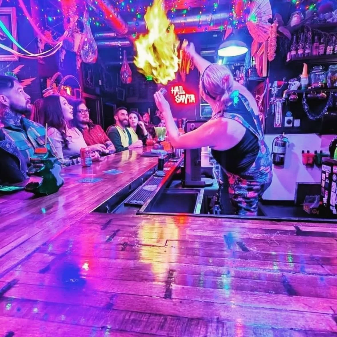
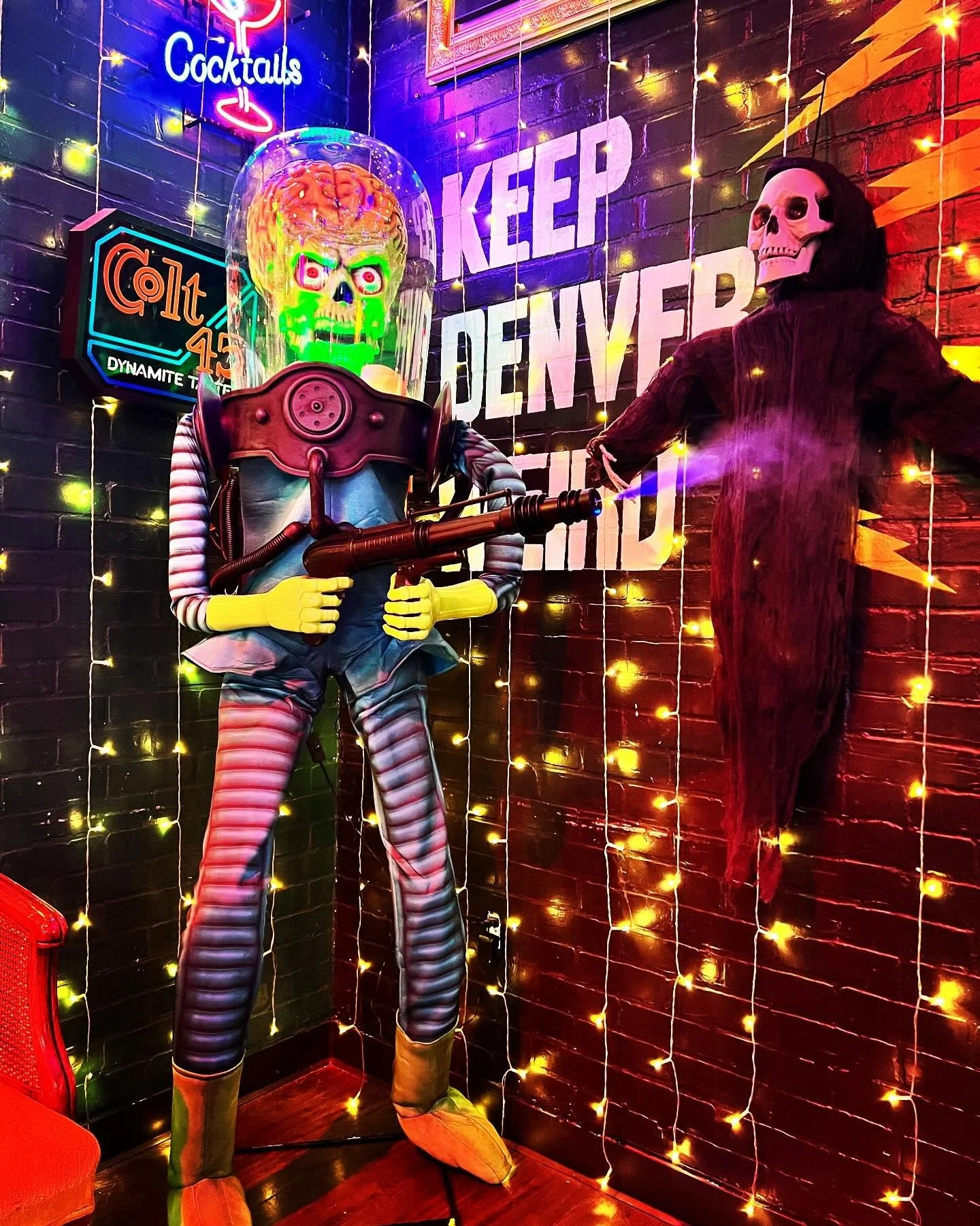
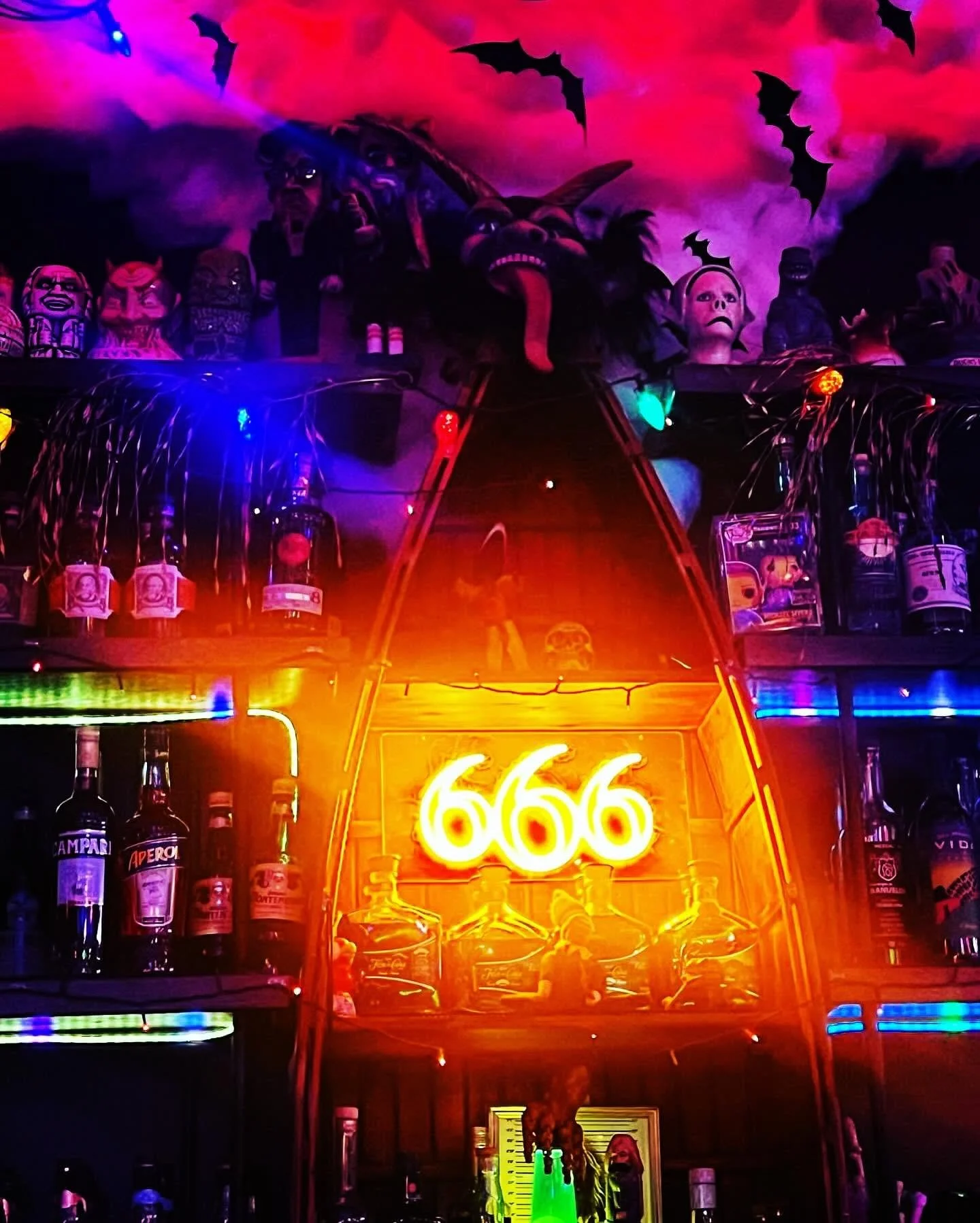
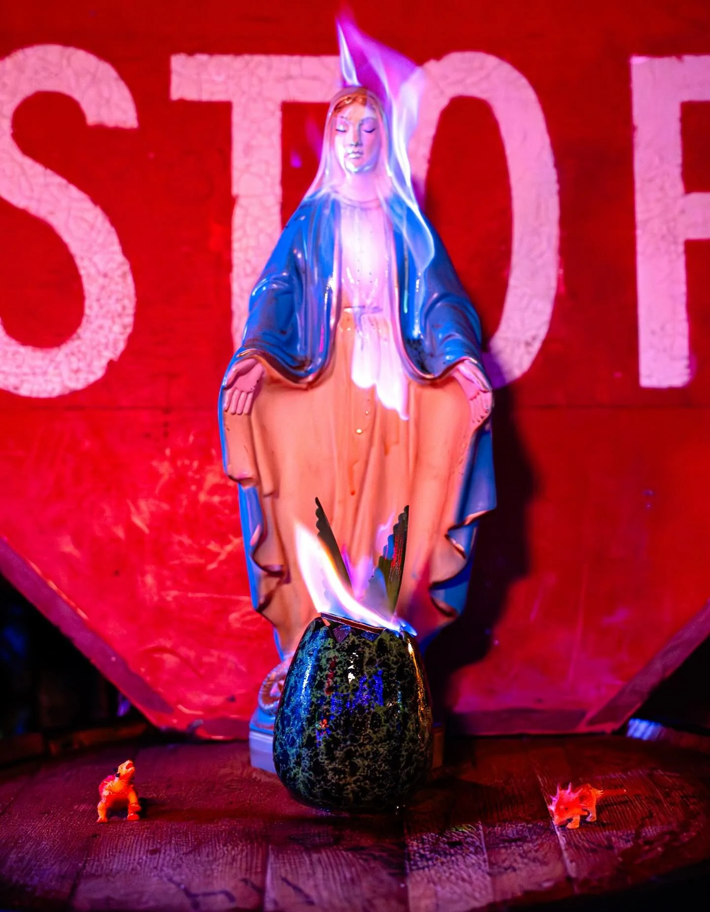
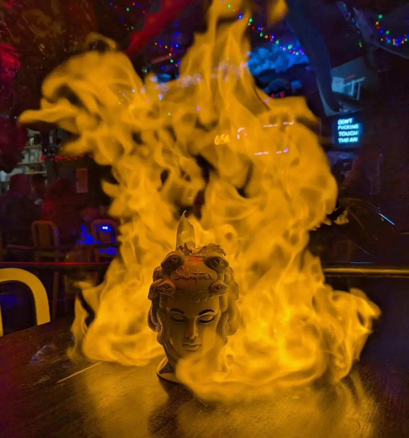
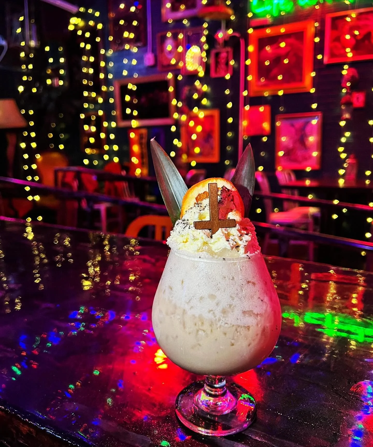
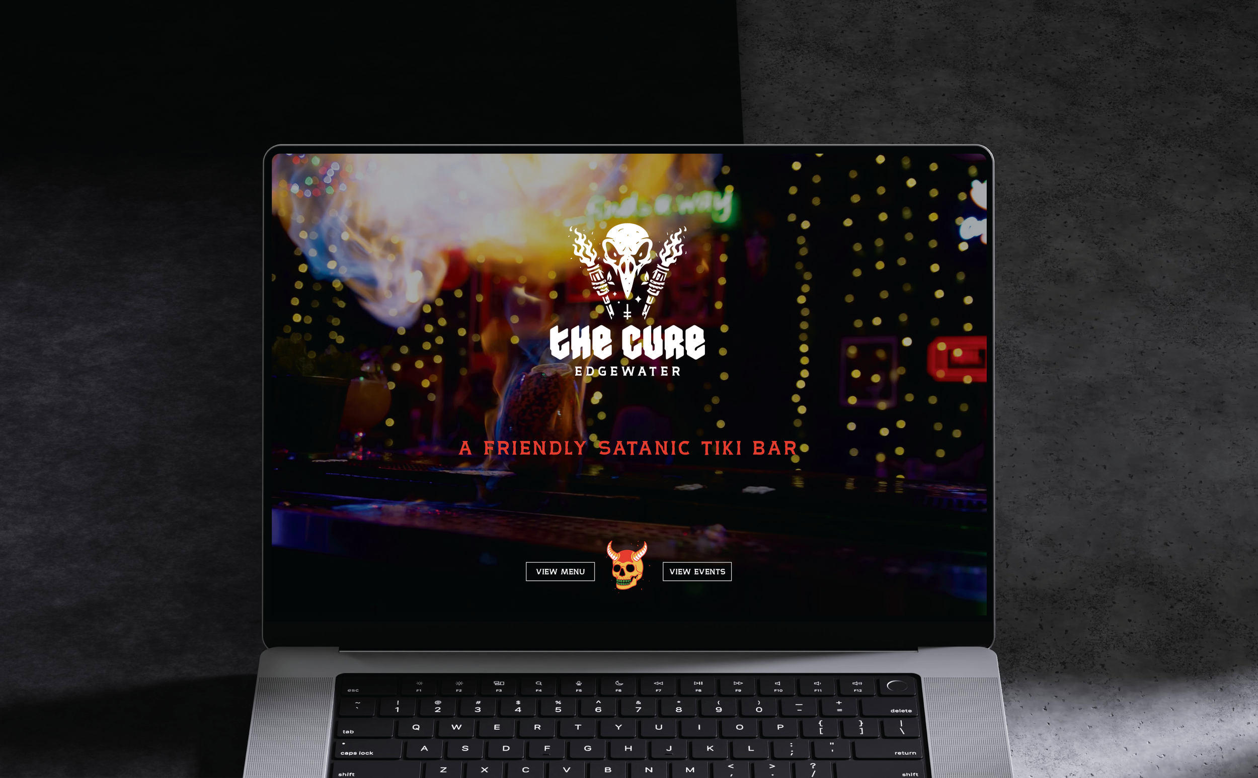
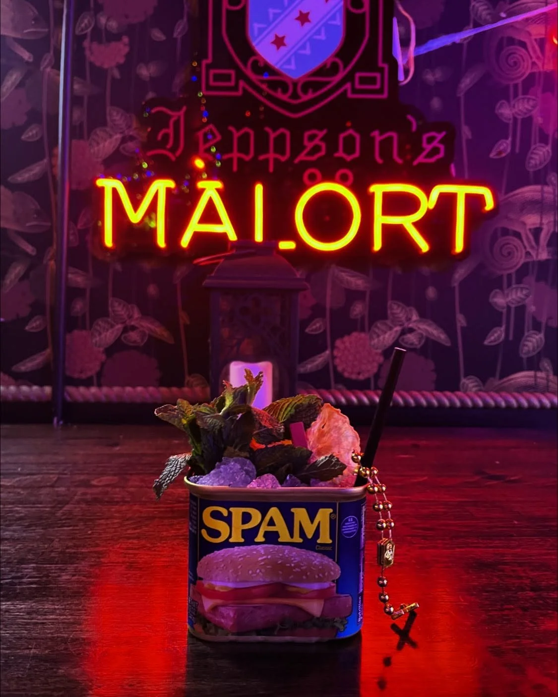
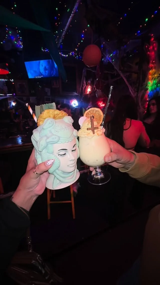
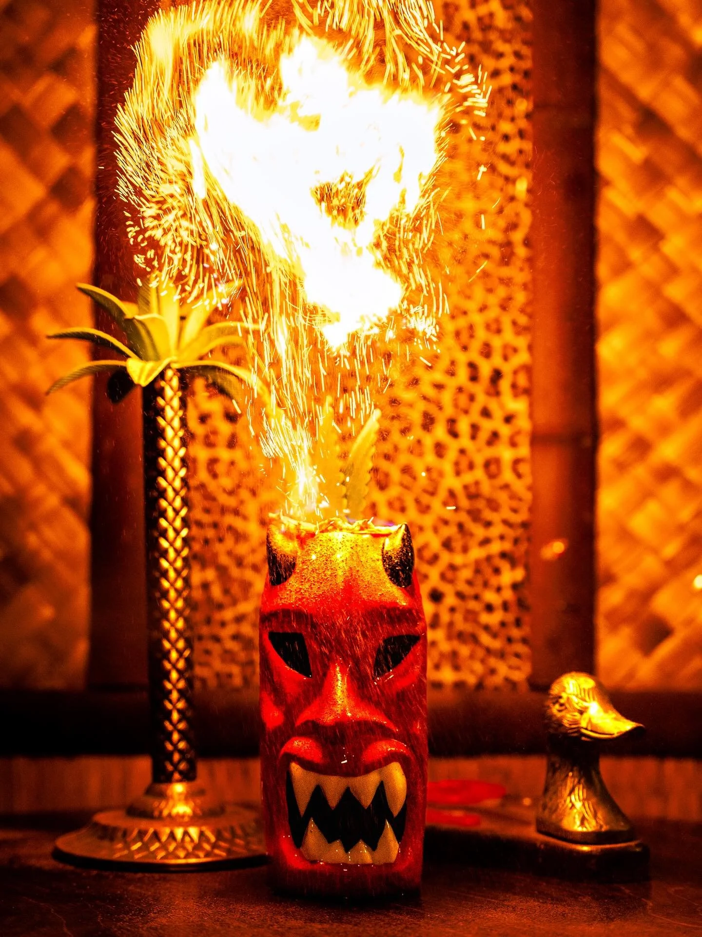
A friendly satanic tiki bar in Edgewater, Colorado. Blending tropical escapism, vintage horror, heavy metal and classic tiki culture, The Cure has built a reputation as a welcoming space where individuality, creativity and community come first.

Approach
The challenge was to create a brand that balanced bold personality with genuine warmth.
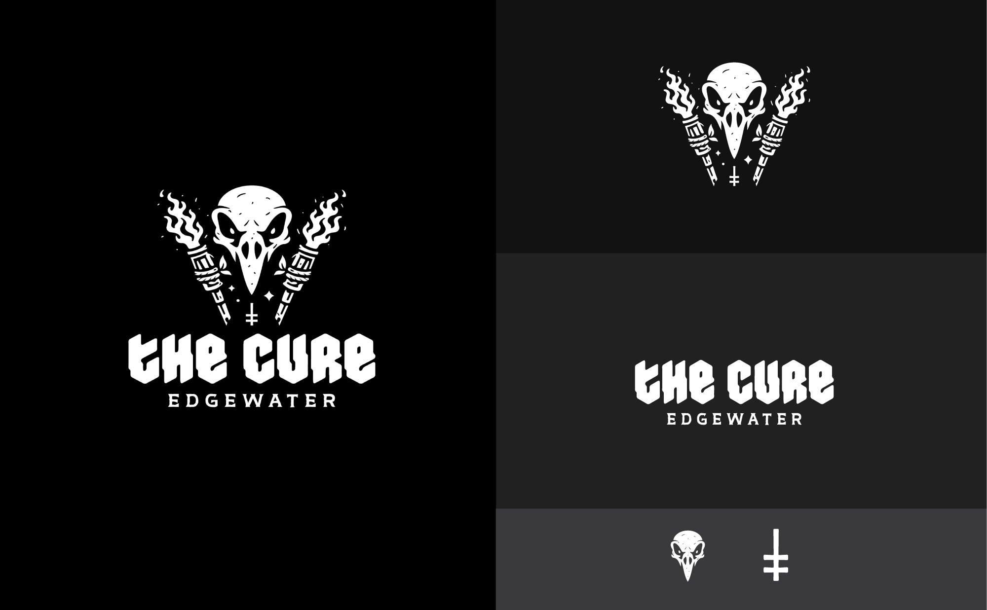
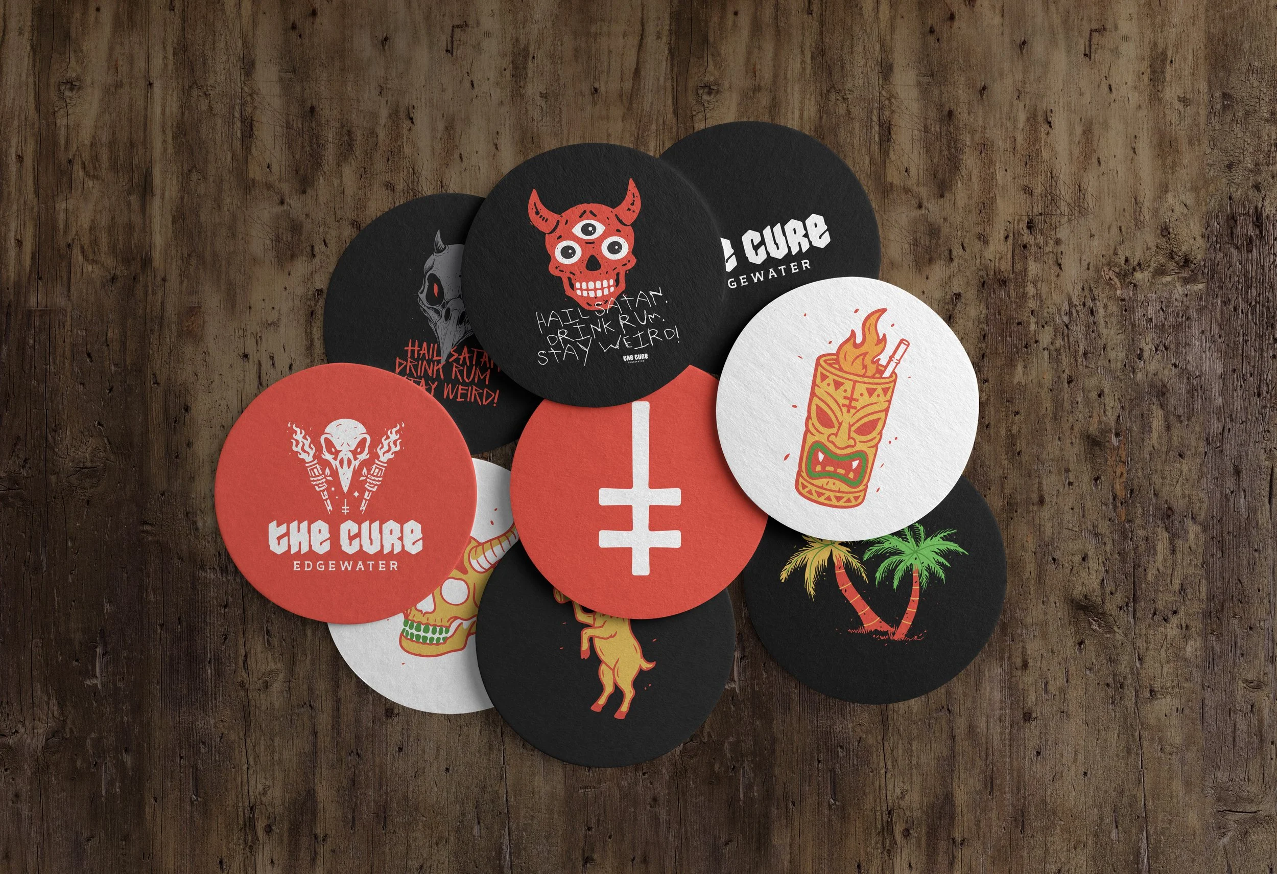
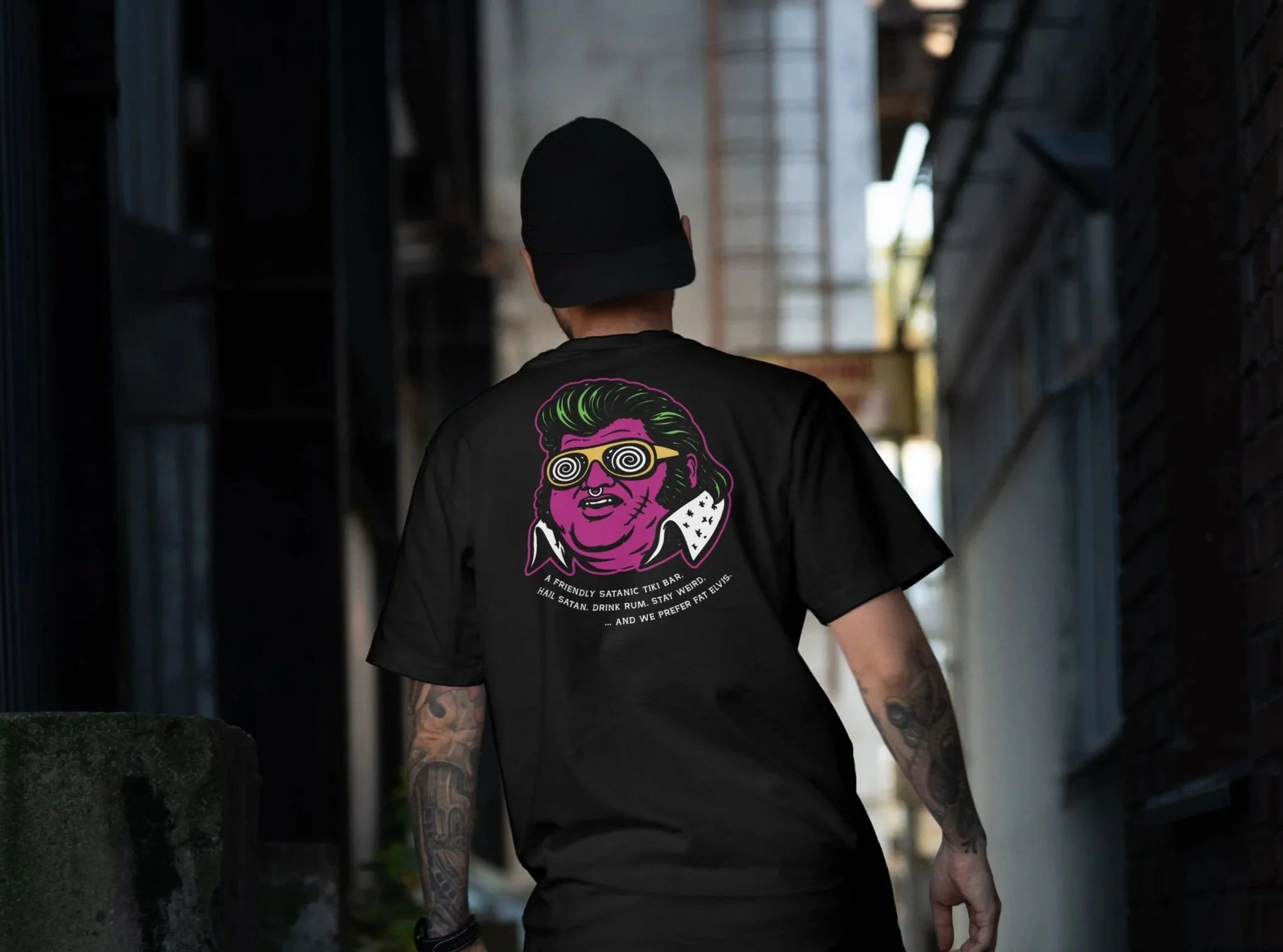
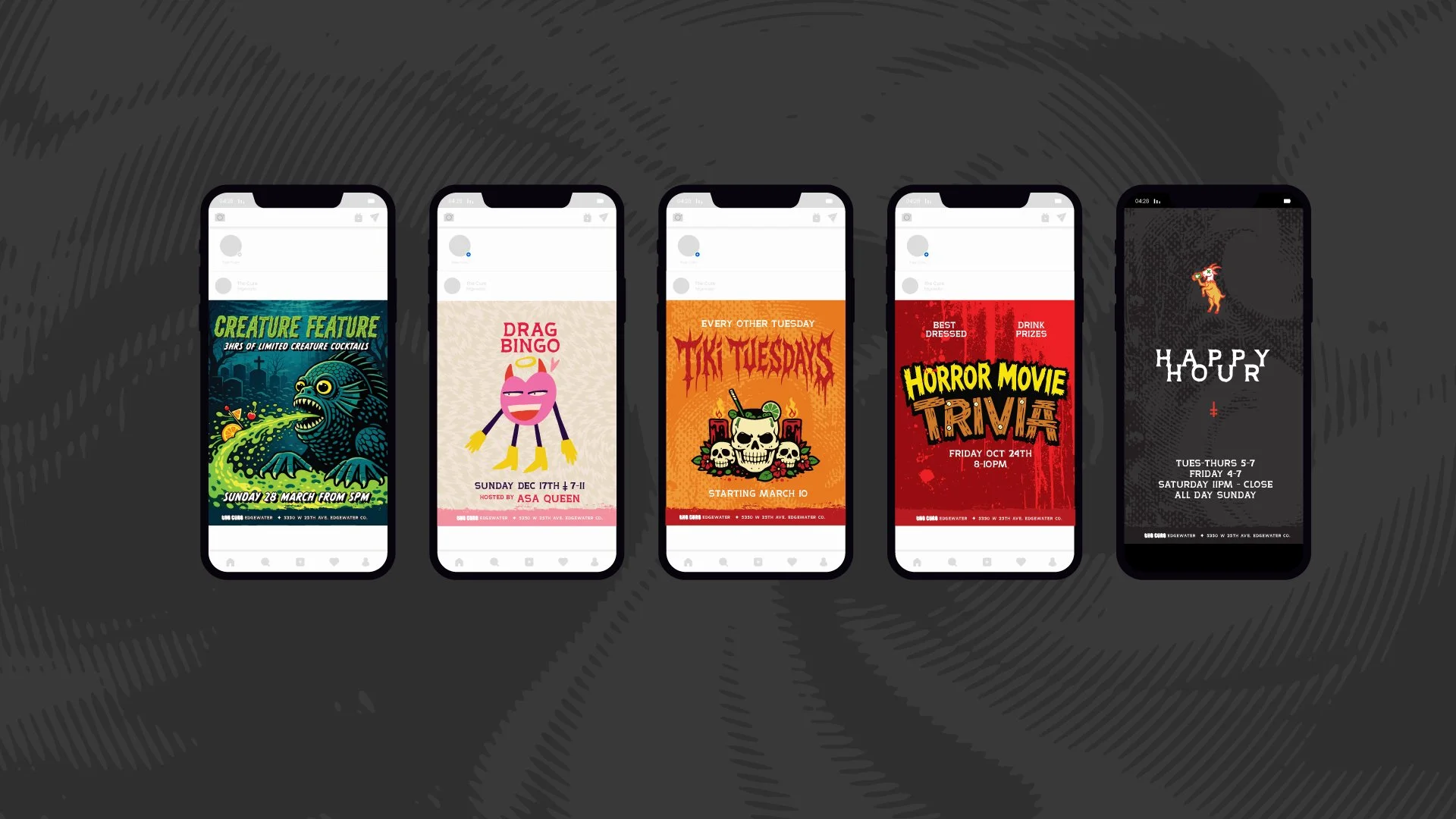
Drawing inspiration from vintage horror posters, underground music culture, tattoo art and traditional tiki iconography, the identity was designed to feel playful, immersive and unmistakably The Cure. While the visual language leans into the venue's darker aesthetic, it also reflects its role as a safe and inclusive space where people from all backgrounds can feel comfortable being themselves.
Rather than creating a static identity, the focus was on building a flexible creative platform that could grow alongside the venue and its community.
Deliverables
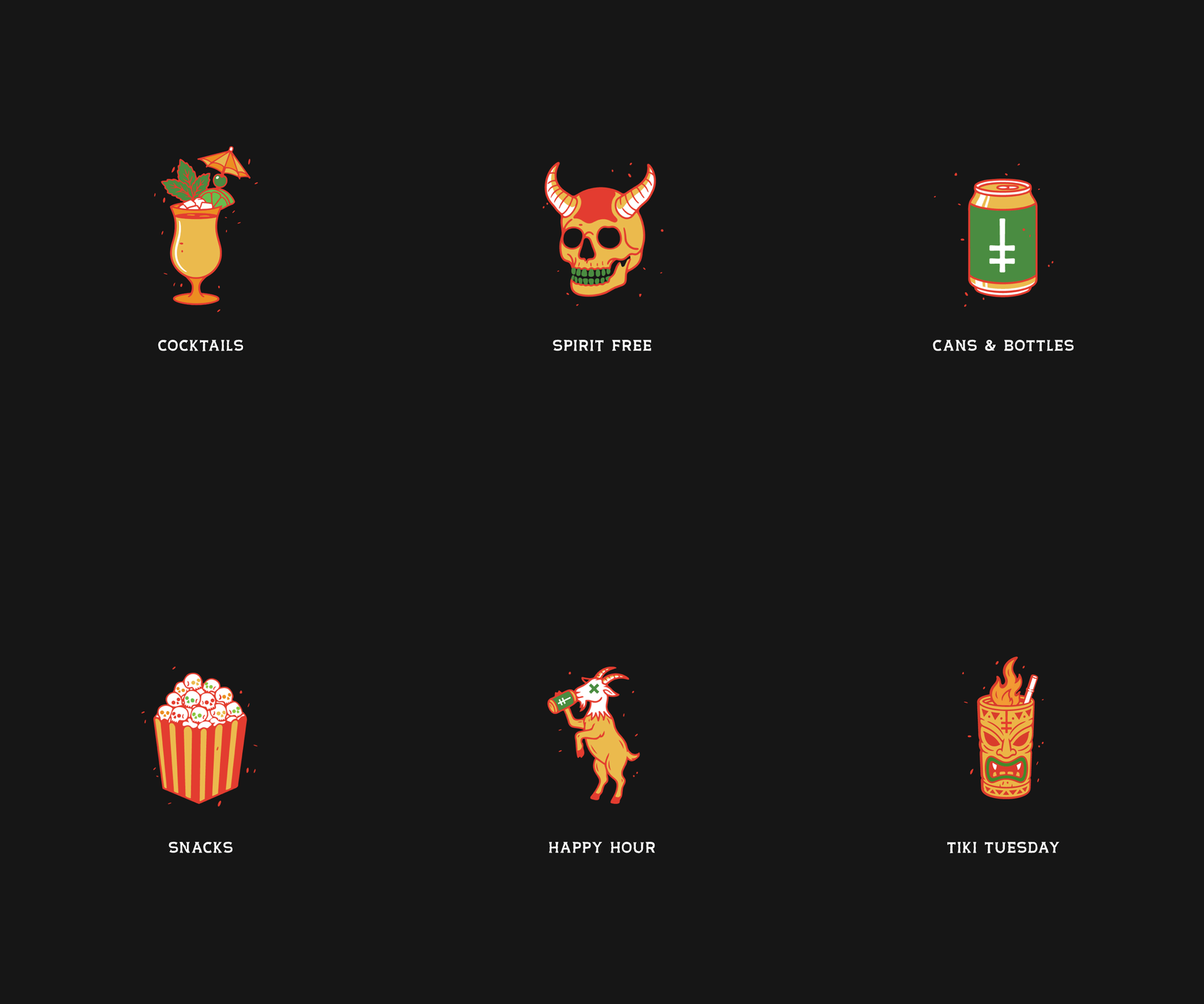
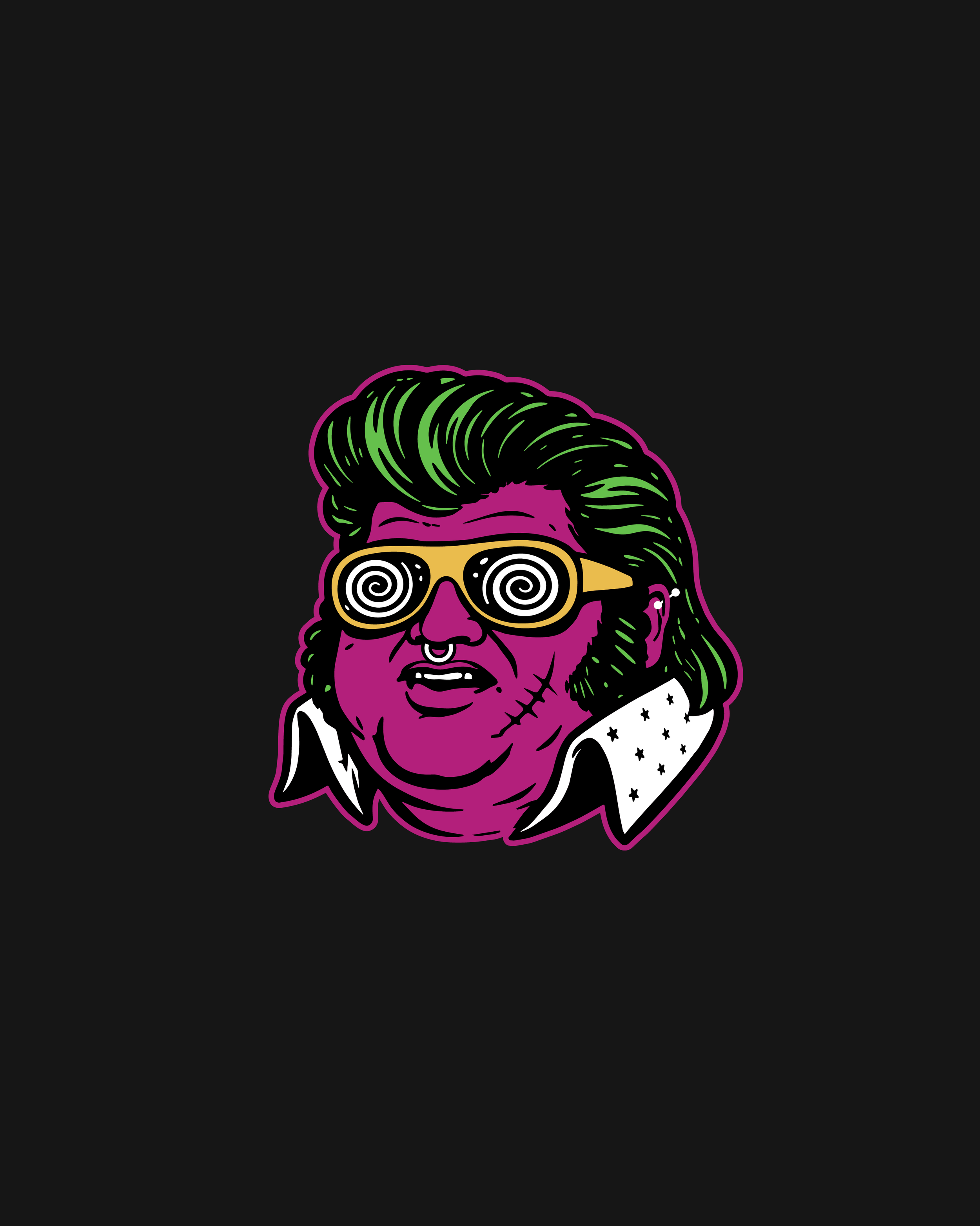
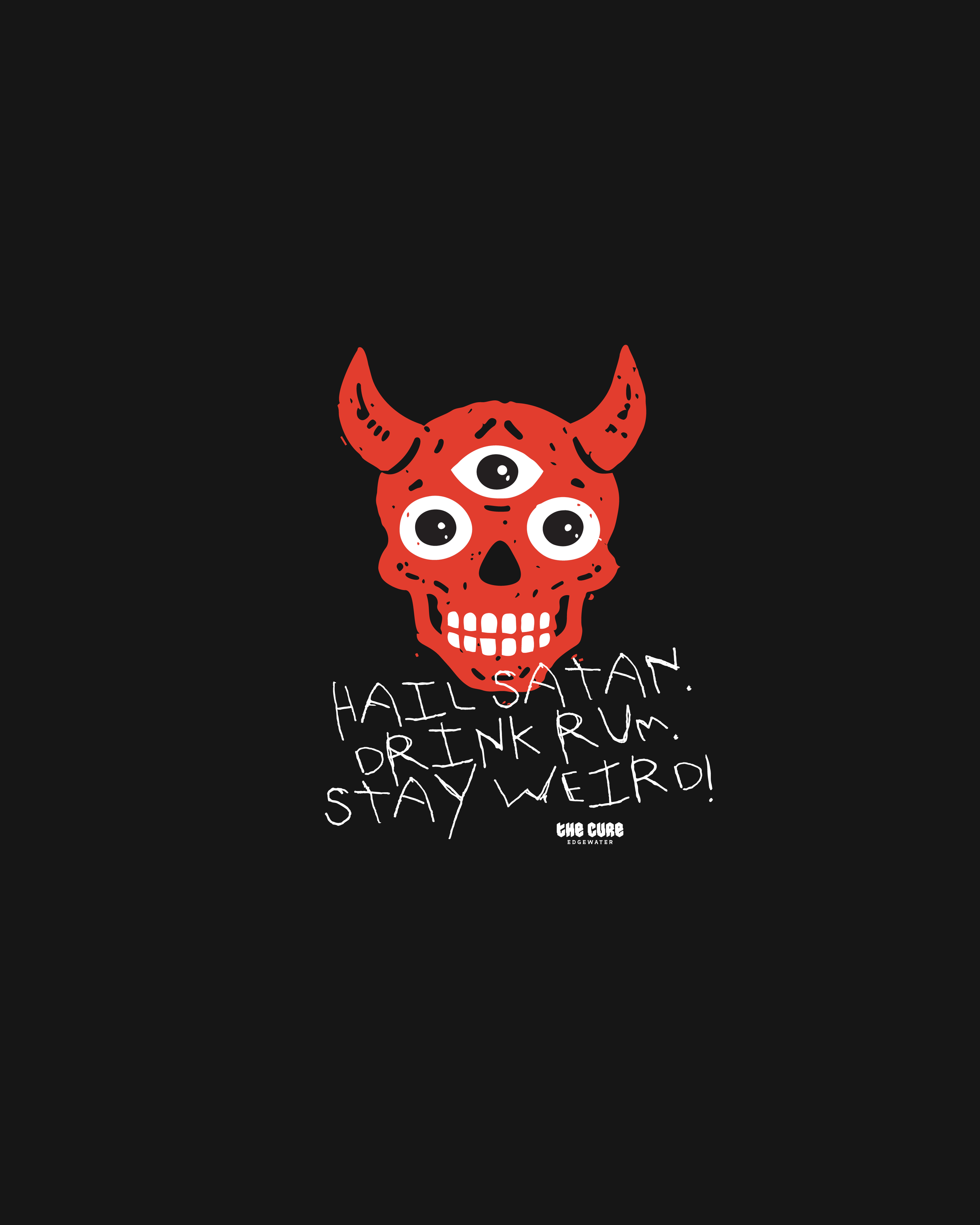
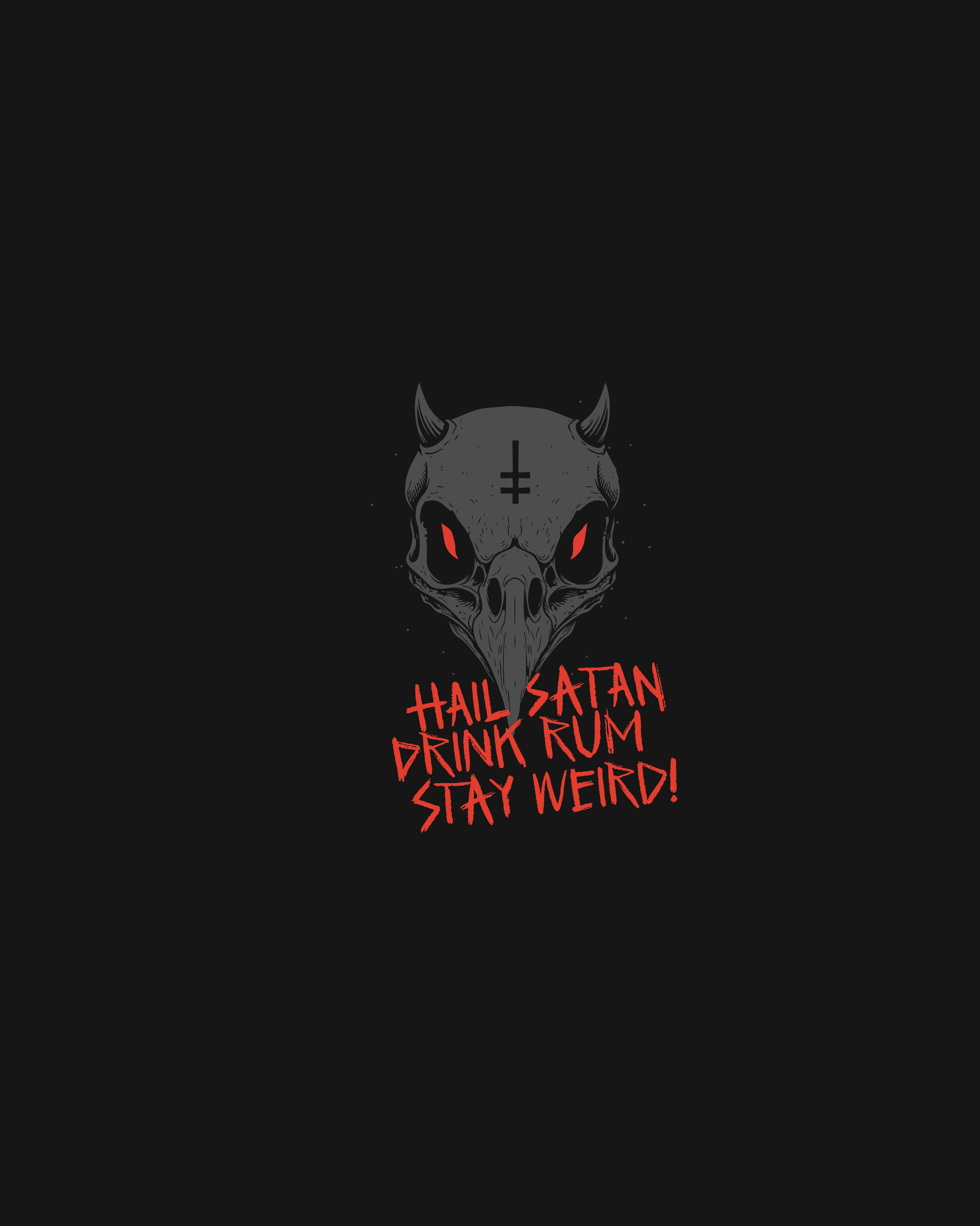
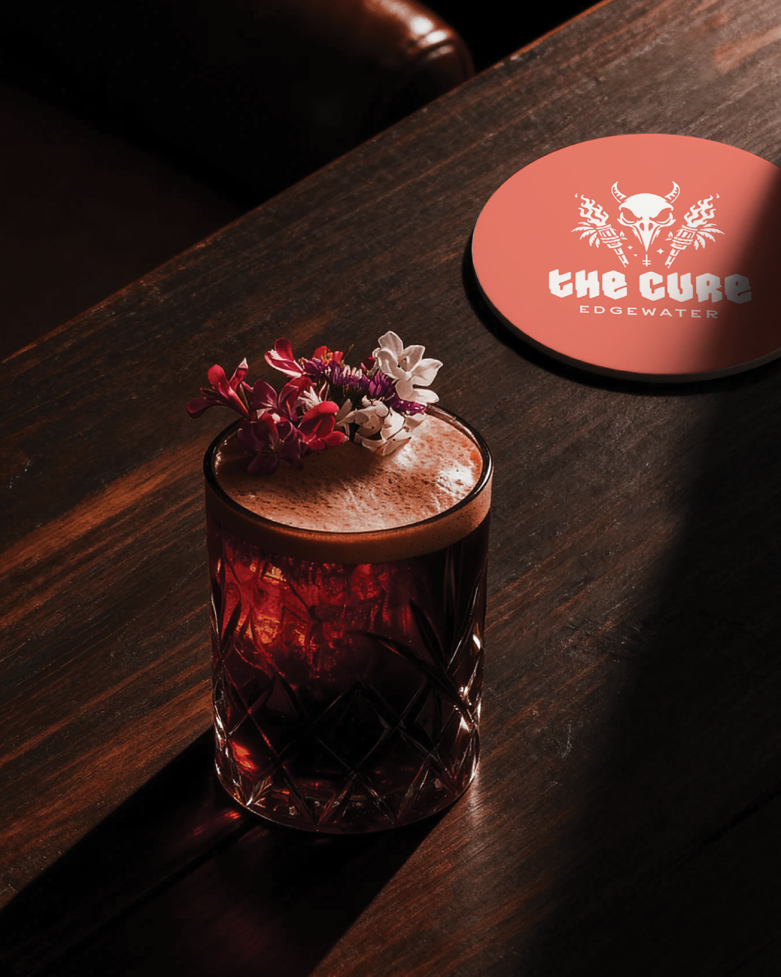
A complete identity system including logos, illustration, iconography, merchandise, menus, social media assets and venue graphics. Inspired by classic tiki culture, vintage horror and underground art, the brand was designed to create a distinctive visual world while providing a framework for ongoing collaboration with local artists and designers. This allows new artwork, merchandise and promotional content to be introduced over time, keeping the brand fresh while maintaining a strong and recognisable foundation.
Outcome
The result is a brand that feels more like a community than a venue. Distinctive, inclusive and full of character, The Cure has a visual identity that supports everything from the bar experience itself through to merchandise, events and artist collaborations, creating a world that customers want to be part of long after their last drink.
SERVICES
BRAND IDENTITY
LOGO SUITE
ILLUSTRATION
ICONOGRAPHY
MERCH & APPAREL
SOCIAL MEDIA ASSETS
BRAND GUIDELINES
CLIENT SINCE
2026
COMPANY
THE CURE, EDGEWATER