
Rubia Coffee is a Melbourne-based roastery with a loyal wholesale following and a new brew bar on the way. When new owners took over and moved into a new location, the brand needed to reflect the shift.
We rebuilt the identity from the ground up, creating a clear and confident system designed to grow across retail, café, and digital touchpoints. It kept the warmth and connection Rubia was already known for.
CLIENT
RUBIA COFFEE GROUP
LOCATION
MELBOURNE, VIC
SCOPE
BRAND REFRESH
PACKAGING
STRATEGY
SIGNAGE
DIGITAL
SOCIAL MEDIA
STUDIO ROLE
BRAND STRATEGY
DESIGN
ROLLOUT
LAUNCH
2024


Problem
Rubia already had a solid reputation, loyal customers, and strong product. But with new owners and a move to a new location, it was time to shift away from the legacy of the previous brand and move in a new direction.
The challenge wasn’t about fixing inconsistencies. It was about redefining the brand’s purpose and setting a clearer path forward. One that felt aligned with the new team, the new space, and a growing vision that included wholesale expansion and a soon-to-open brew bar.
Approach
We started by stripping the brand back to what mattered most. Community. Routine. Familiarity. These ideas formed the basis of a new strategy focused on clarity, consistency, and connection.
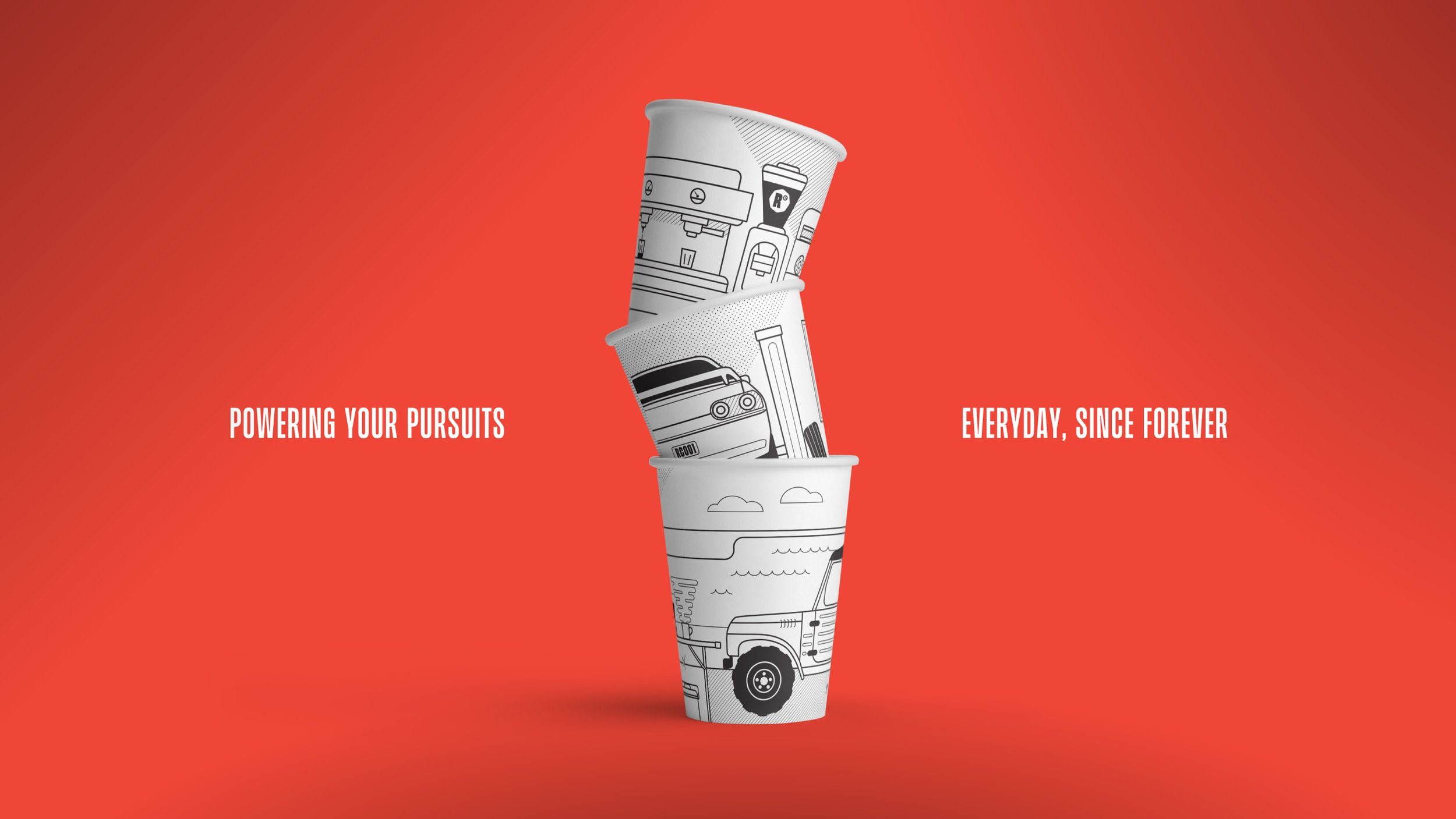
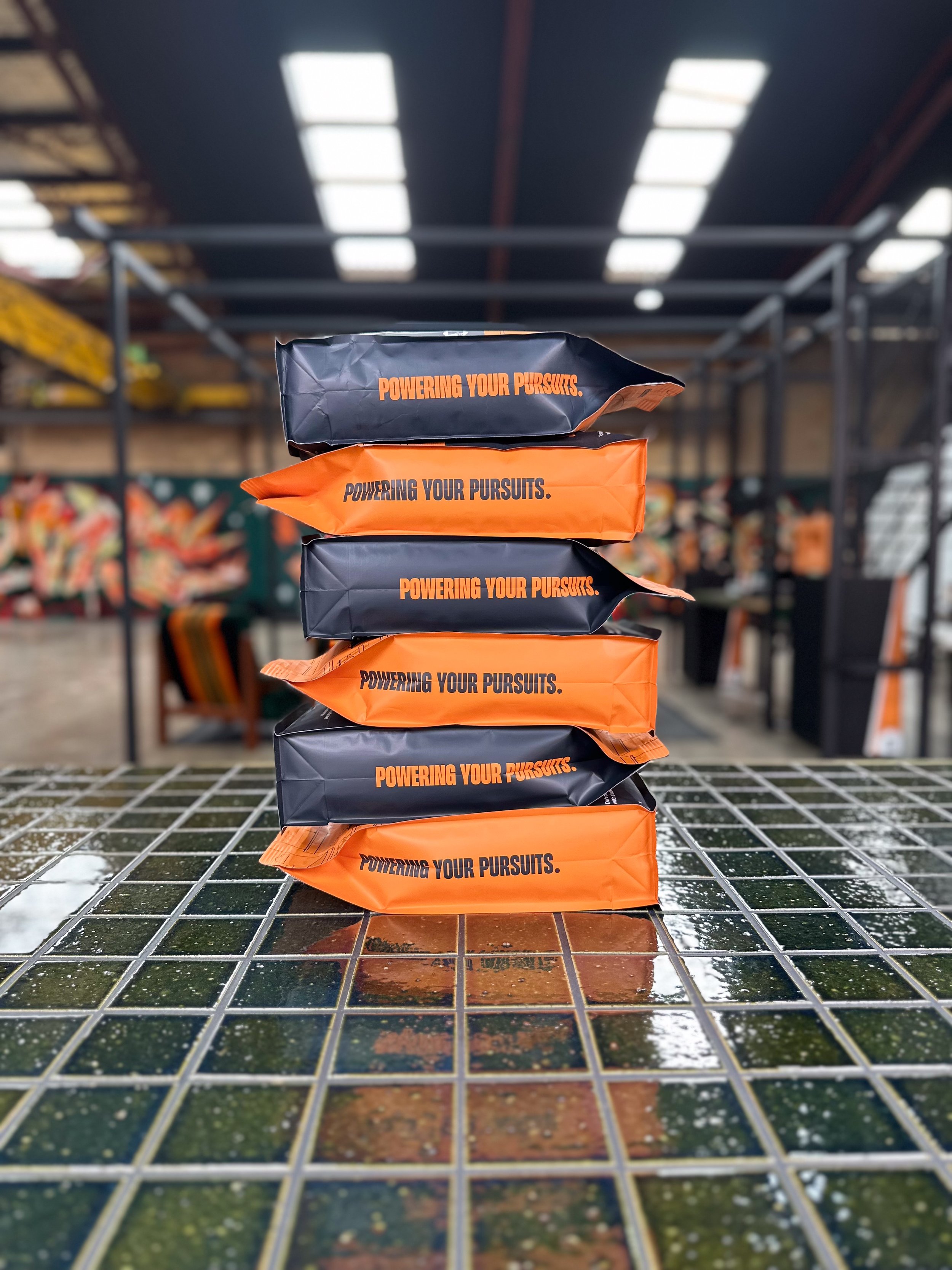
We introduced a central brand idea. Powering your pursuits became the message behind everything Rubia did. Whether it was a takeaway coffee or a café supply order, the brand needed to feel like support for whatever came next.
This thinking shaped the tone of voice, identity system, and overall direction. It had to be strong enough to scale, but grounded enough to stay human.


Deliverables
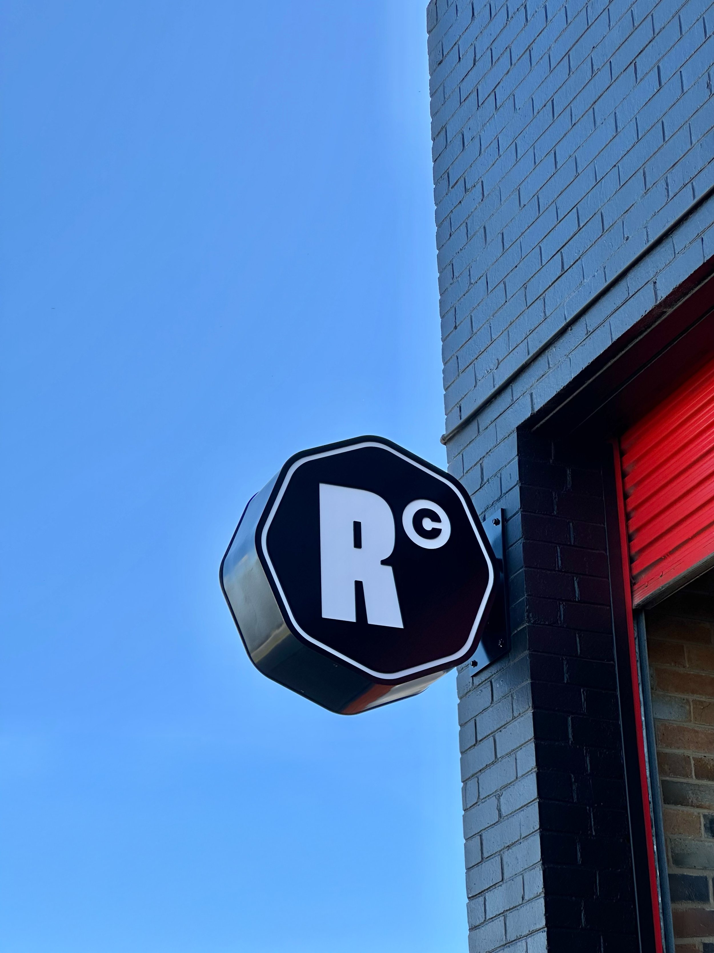
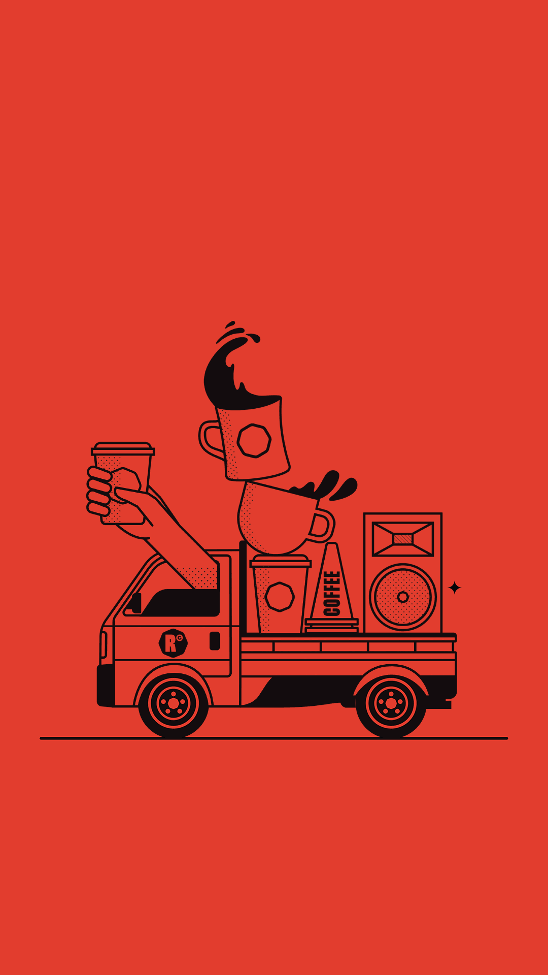
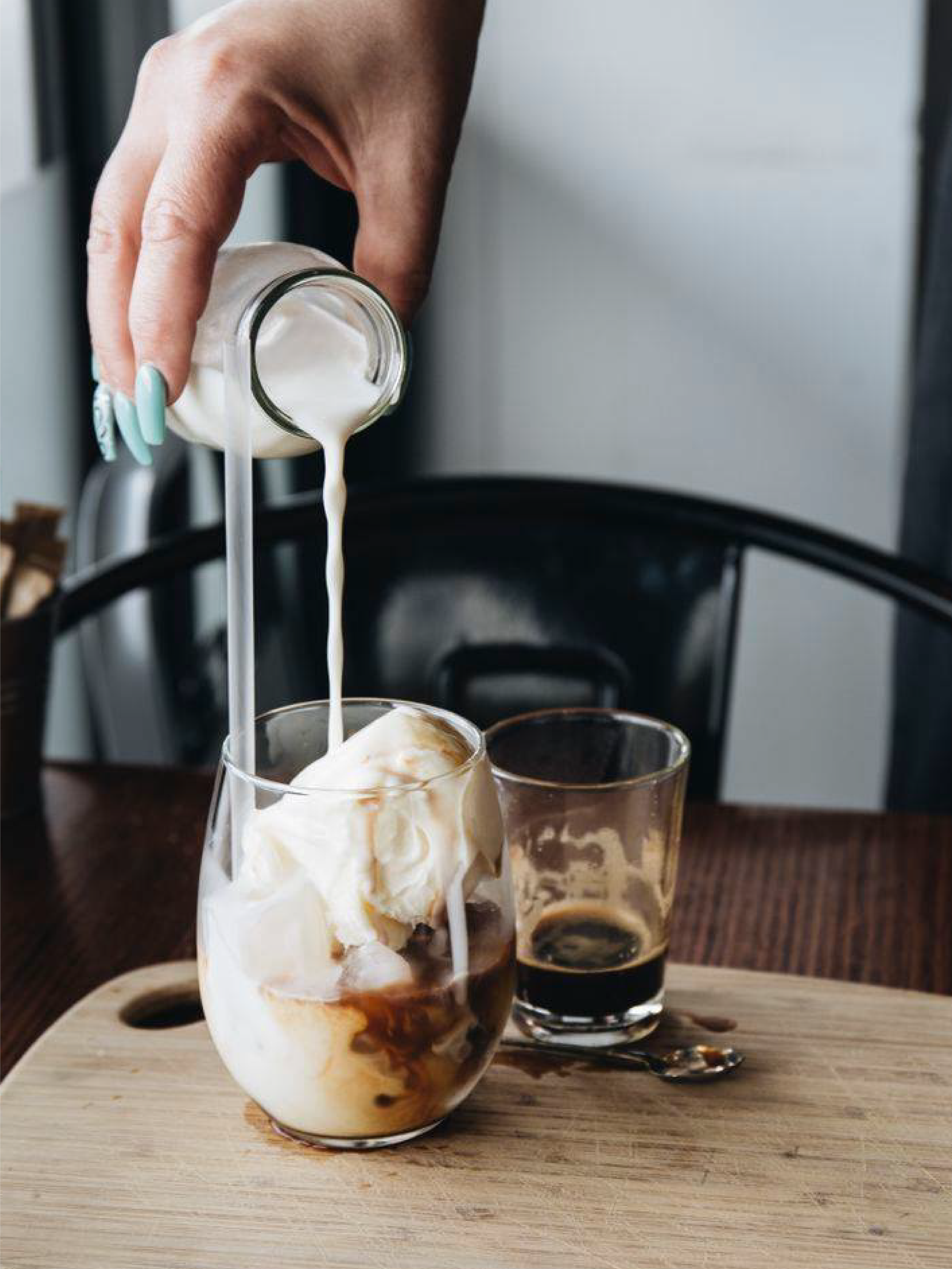
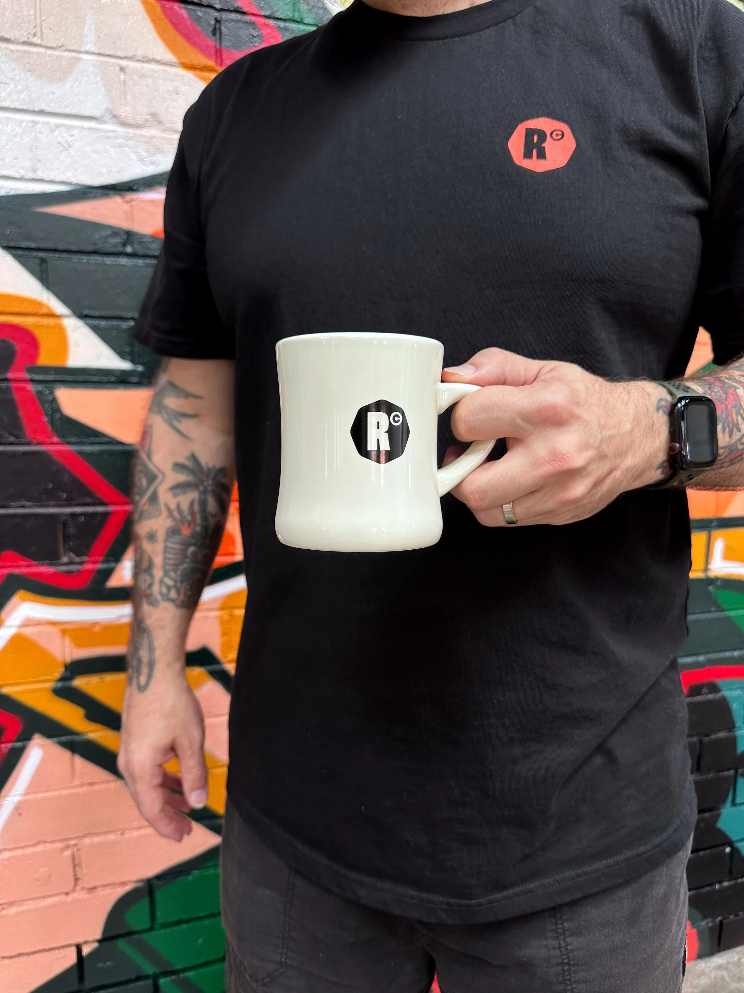
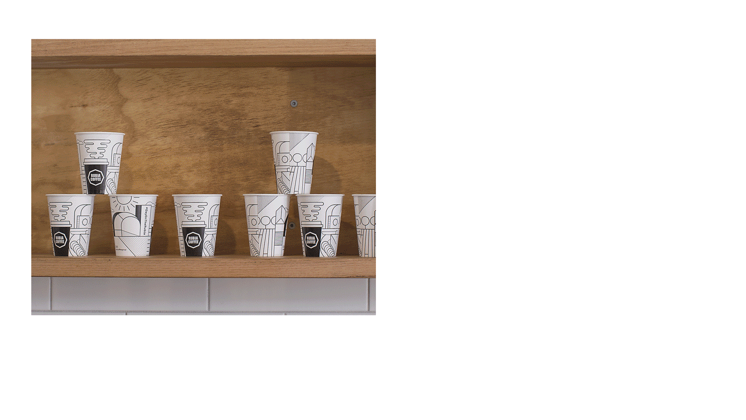
We rebuilt the identity from the ground up. That included a refined wordmark, updated icon, new typography, and a colour palette built around red, orange, black, and soft greys. The system is eclectic but cohesive, designed to flex across coffee bags, apparel, takeaway items, and signage.
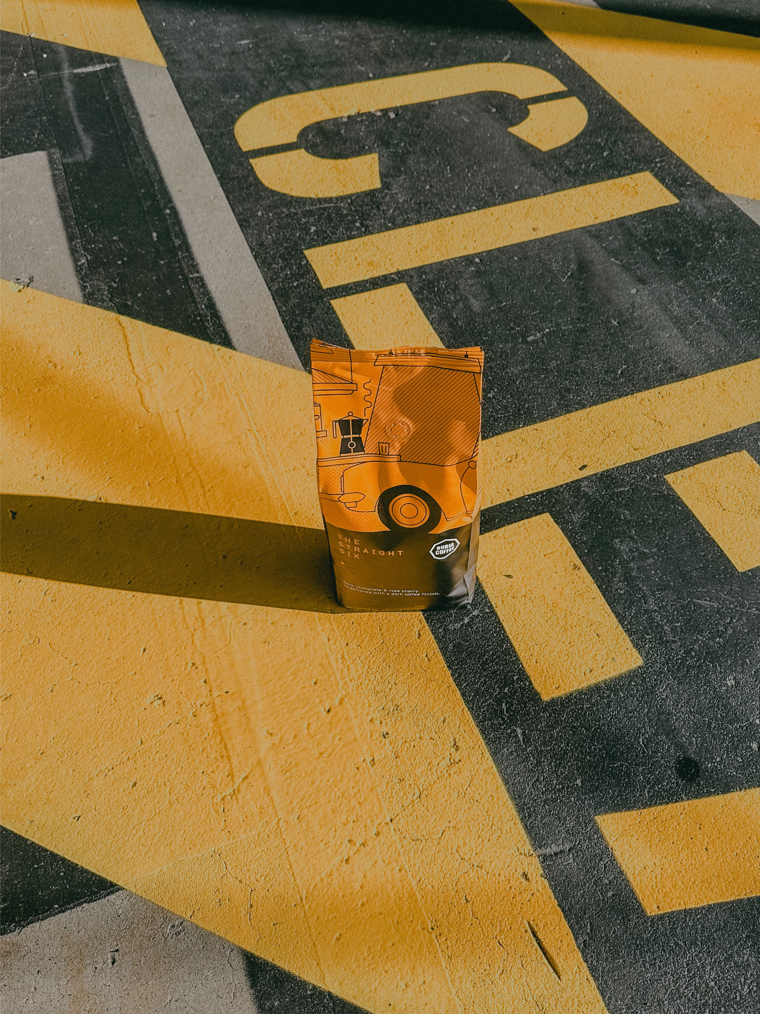
Packaging was reworked with a layout structure that supports both core blends and seasonal drops. We created production ready files, worked with suppliers on stock and finishes, and provided guidance on photography and content.
We also designed and built the Squarespace website, developed the brand copy, and continue to support Rubia with social content that keeps the voice consistent across every touchpoint. The upcoming brew bar will carry this system into a physical space.


Outcome
The rebrand launched across wholesale first, with immediate results. Regular customers noticed the shift. Wholesale clients appreciated the clarity. The team reported smoother day-to-day use and better alignment across all formats.
Social engagement increased, with more followers and stronger interactions. Online sales have seen steady growth.
The system now supports seasonal products, branded merchandise, and the upcoming launch of Rubia’s brew bar. Everything works together without losing the character of the original brand.


Final thought
Rubia Coffee is a perfect example of what happens when design and purpose work together. The result is simple, effective, and clear. No gimmicks. Just a brand that does what it needs to.